this visual identity concept was created in response to a logo design contest held by yes i'm designer community (www.yesimadesigner.com) for “aloe vera”, a natural skincare brand seeking a clean, minimal and contemporary image.
the aim was to develop a distinctive and versatile identity that could communicate the natural character of the brand without relying on the familiar and often overused literal representation of the aloe vera plant.
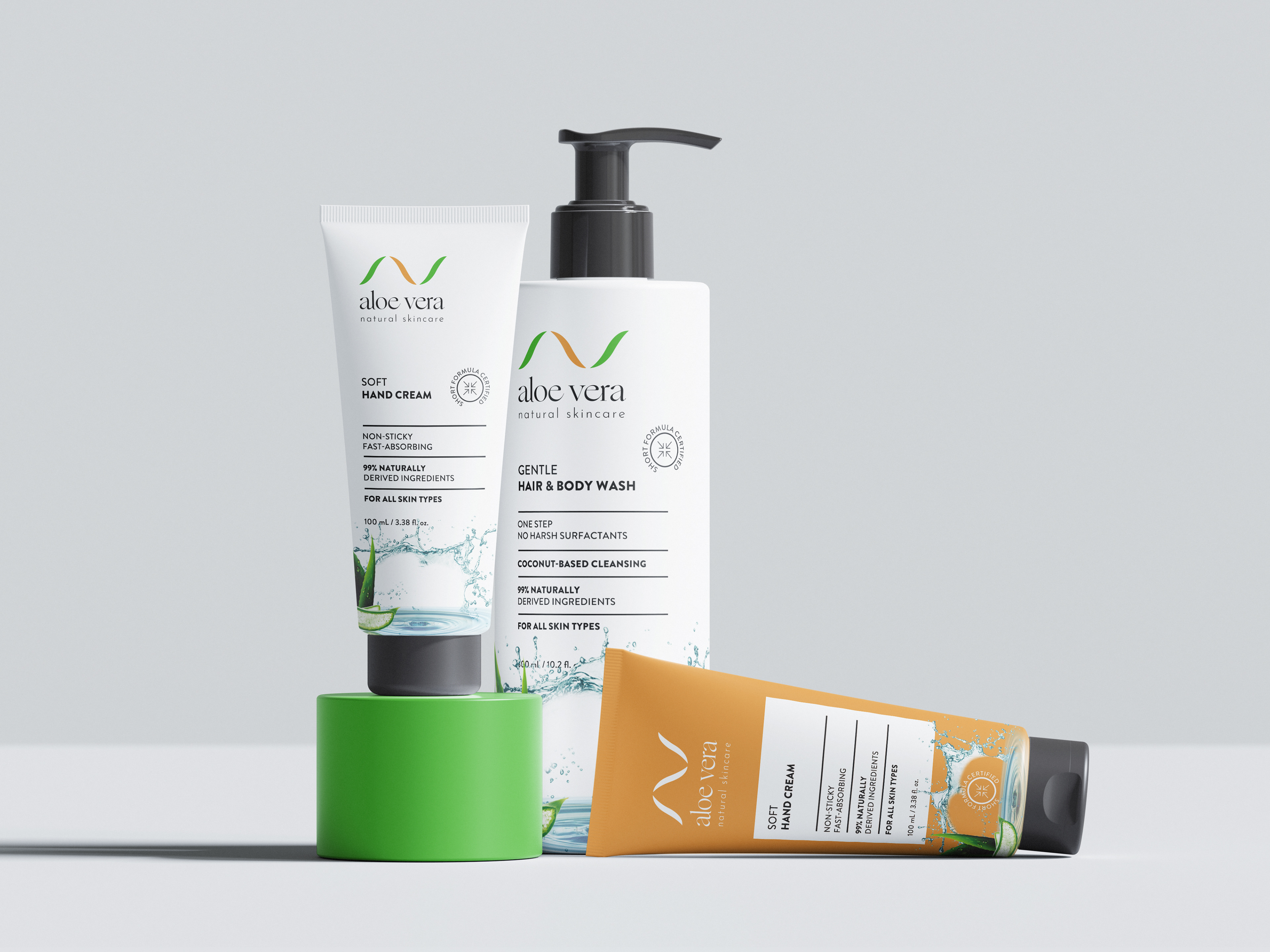
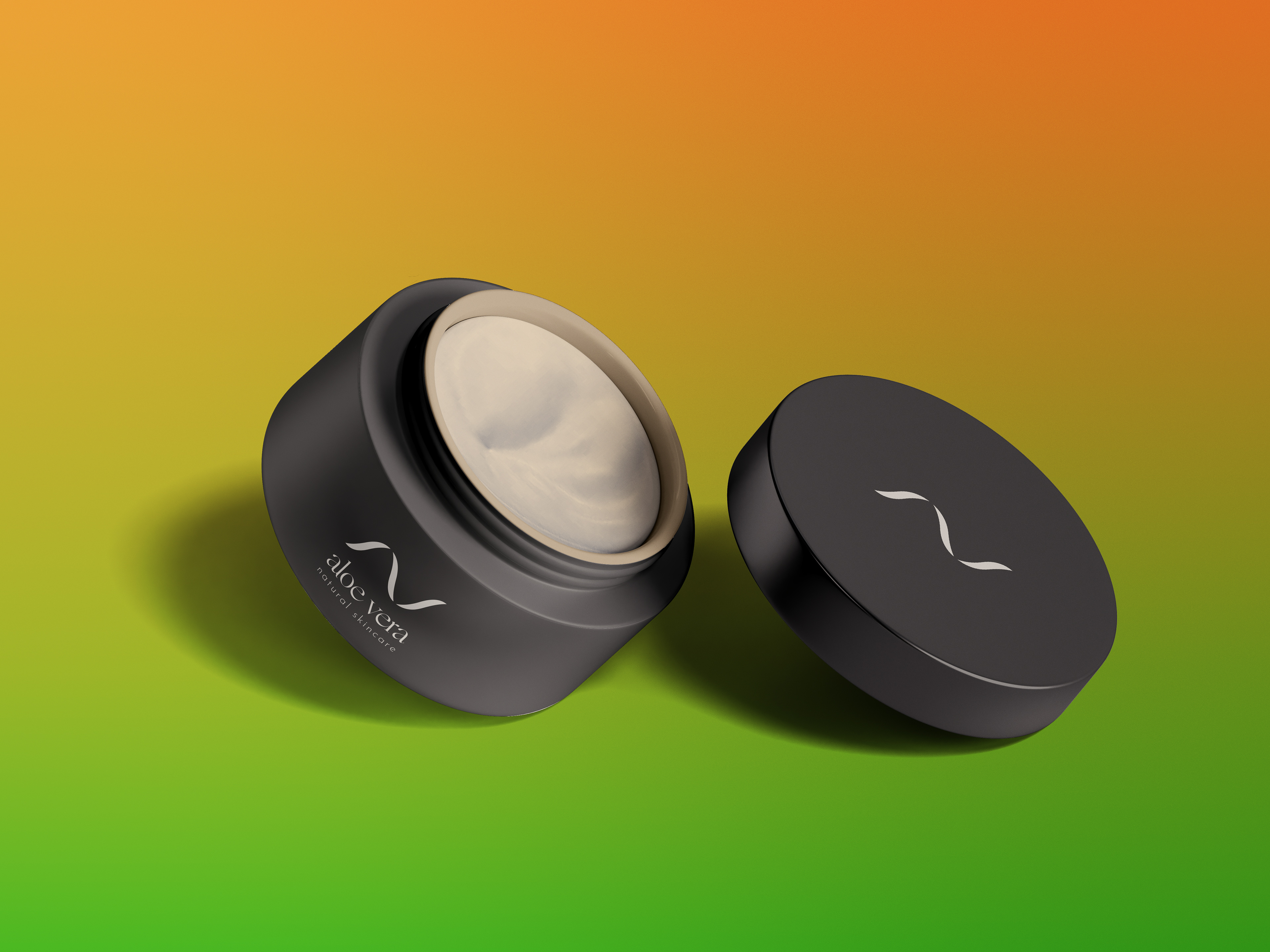
the concept is based on an abstract organic symbol inspired by the pointed curves of aloe leaves and the initials “a” and “v”. the two flowing forms come together to create a simple and memorable mark that feels natural, balanced and modern.
the soft movement of the symbol reflects the gentle and caring qualities associated with skincare, while its upward direction suggests freshness, vitality and renewal. its minimal construction allows the mark to remain clear and recognisable across different sizes and applications.
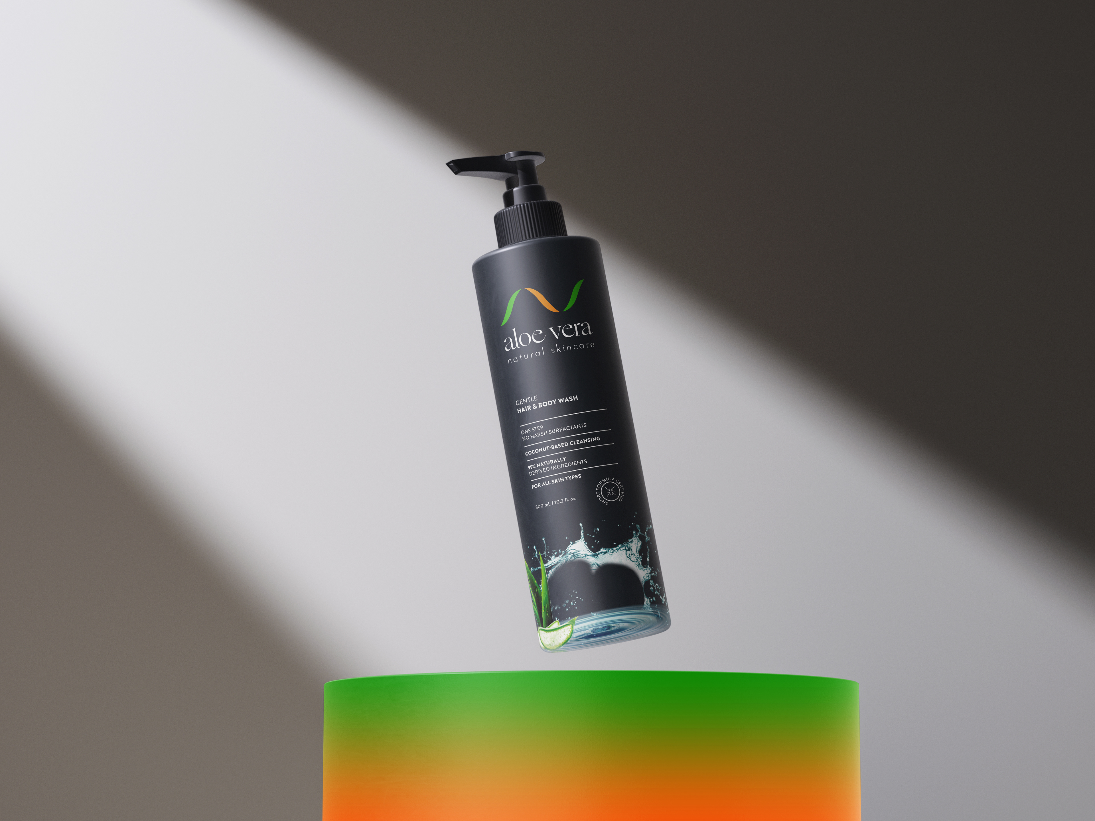
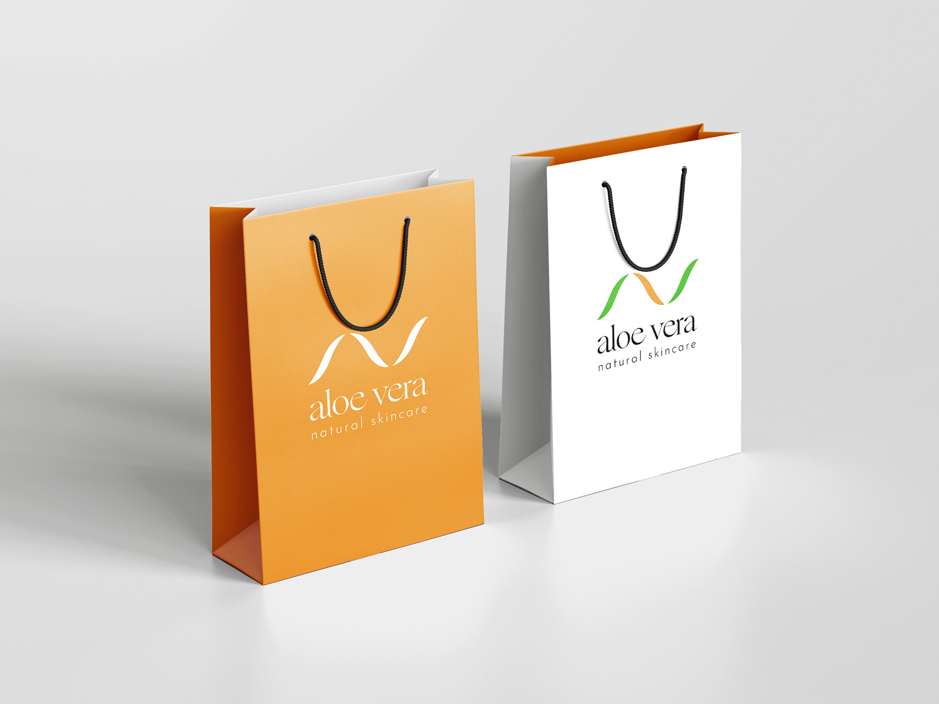
the colour palette combines a warm earthy orange with a fresh green. orange introduces warmth, energy and approachability, while green reinforces the connection with nature, wellbeing and plant-based ingredients. charcoal was introduced in selected packaging applications to create a more refined and premium character while maintaining strong contrast and versatility.
the typography was selected to support the elegance and simplicity of the symbol. the brand name “aloe vera” is presented with a refined, contemporary character, while the tagline “natural skincare” adds clarity and communicates the brand’s positioning in a subtle and understated way.
the identity was designed to perform consistently across both light and dark backgrounds. from skincare packaging and product containers to retail bags and promotional applications, the visual system remains coherent, recognisable and adaptable.
the final concept creates a brand identity that feels natural without becoming predictable, premium without appearing distant, and contemporary while remaining warm and approachable.
a minimal skincare identity built around one central idea:
nature, care and modern simplicity expressed through one fluid organic symbol.