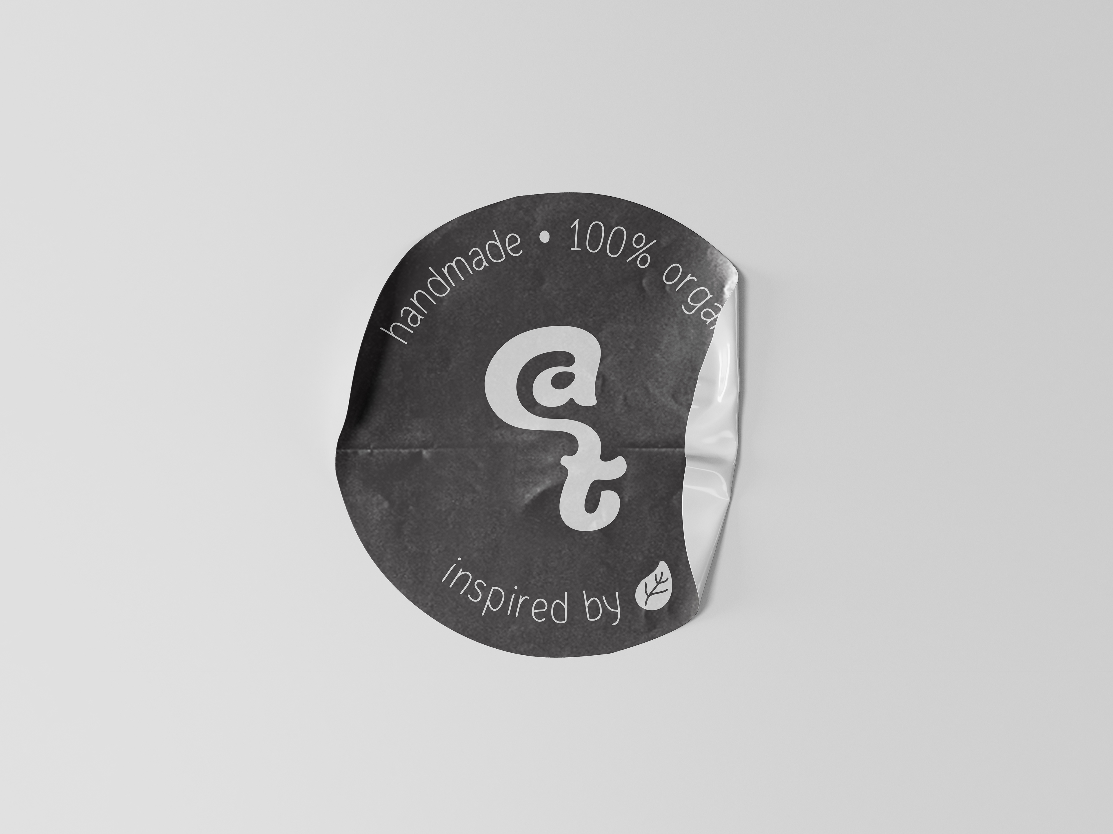
candle tales’ rebranding was developed as an alternative visual interpretation of the brand’s warm, sensory and handcrafted character.
the aim was not to replace its existing identity, but to explore how it could evolve towards a more premium and lifestyle-oriented visual direction.
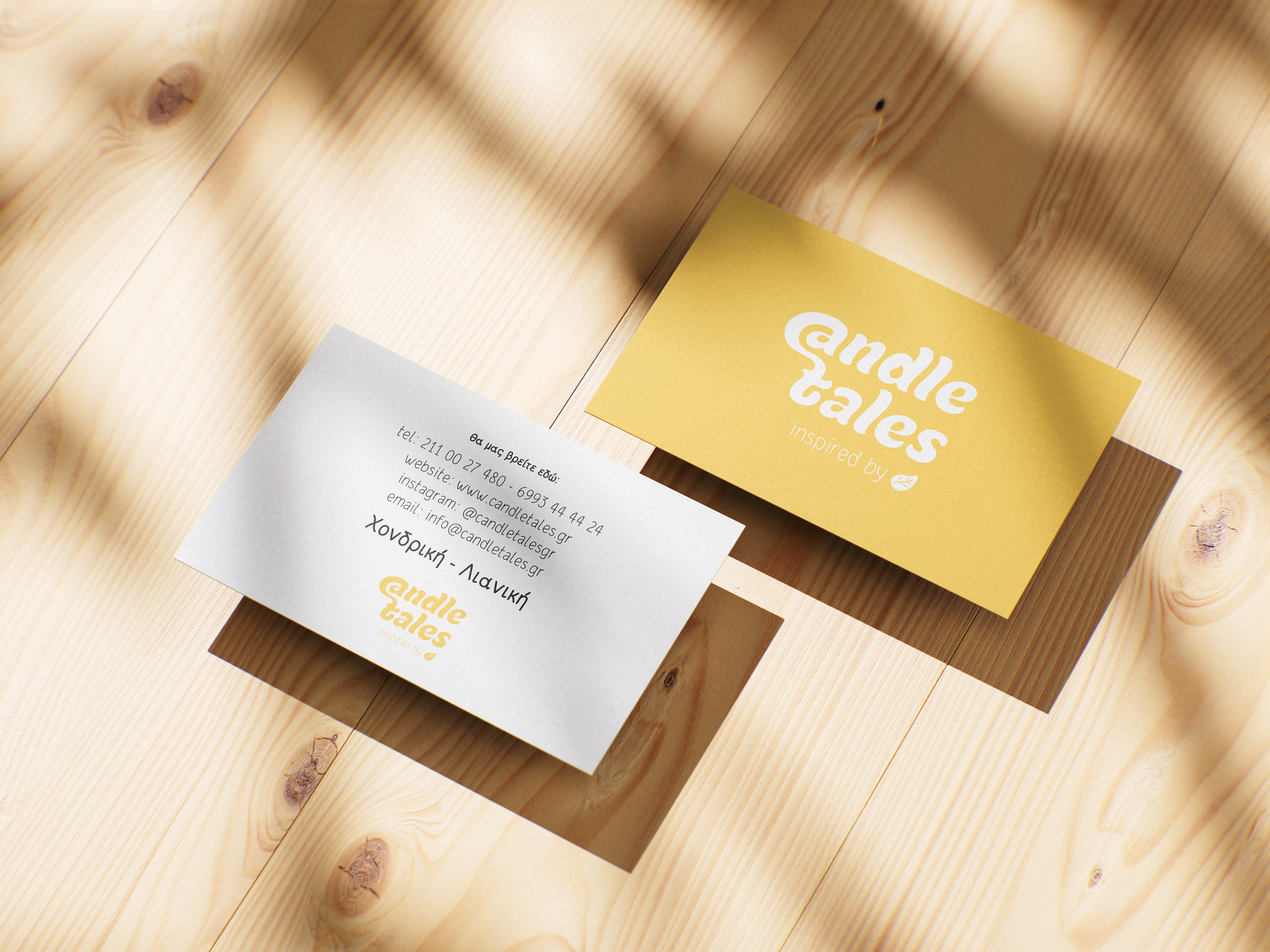
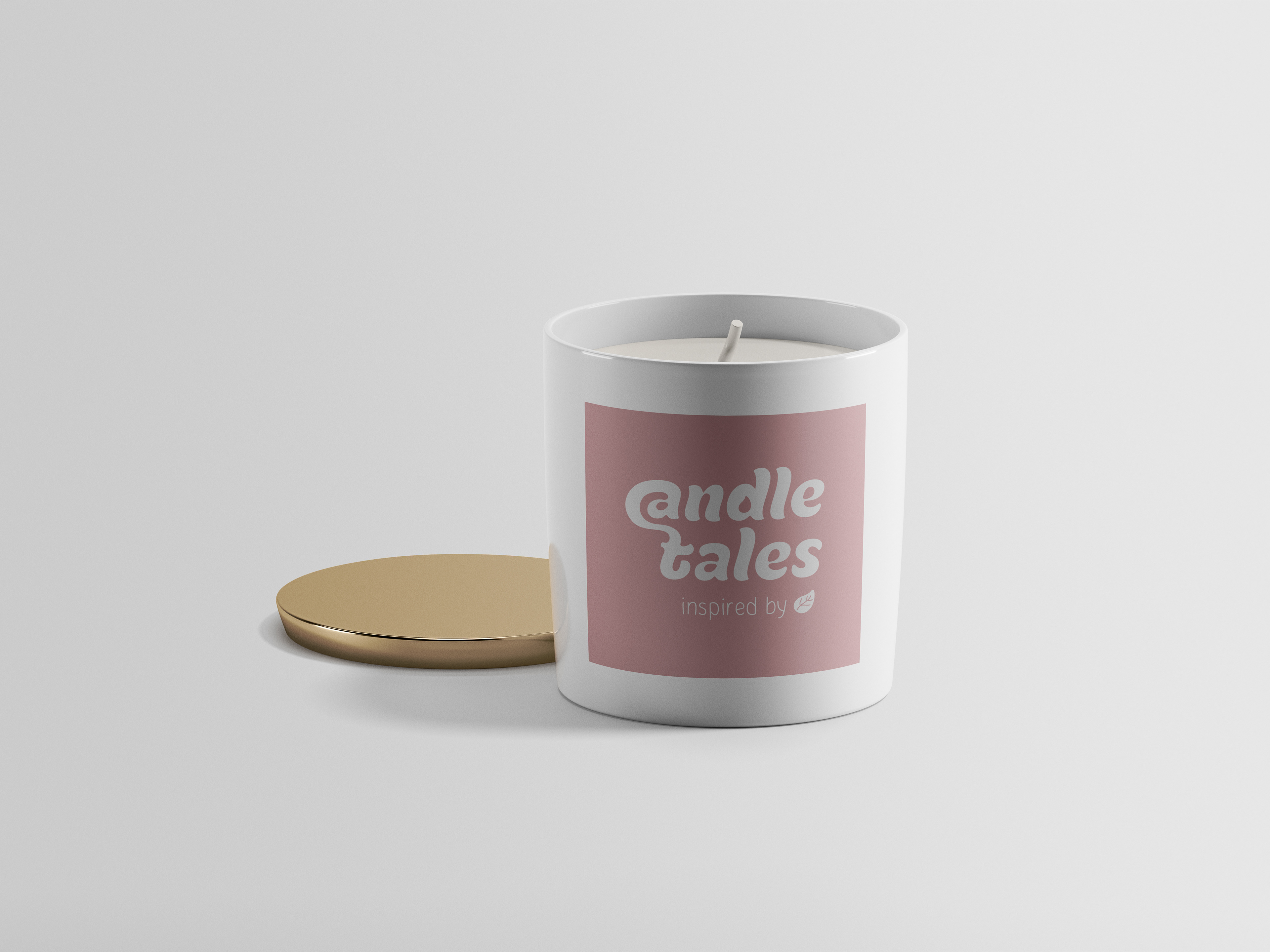
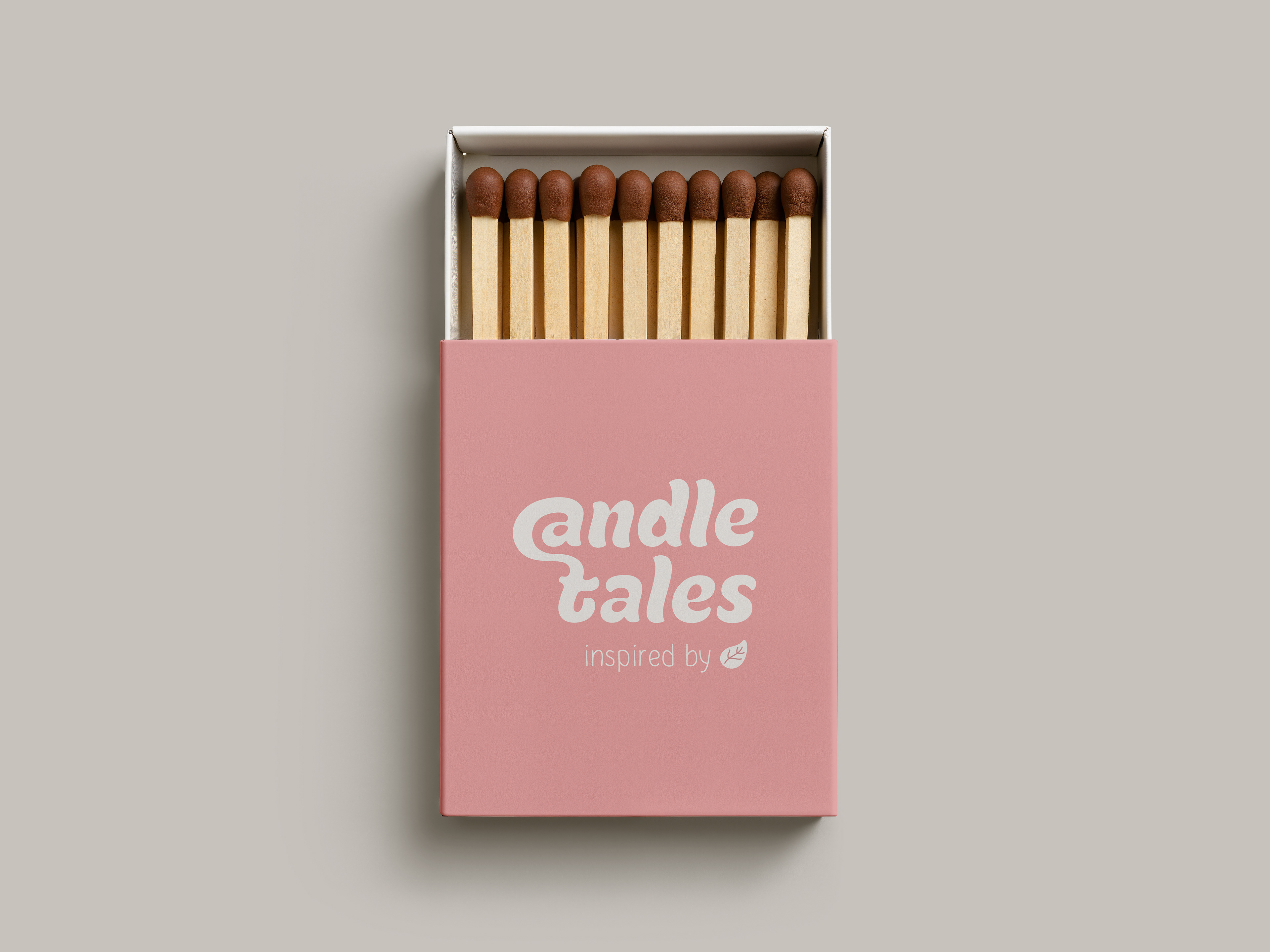
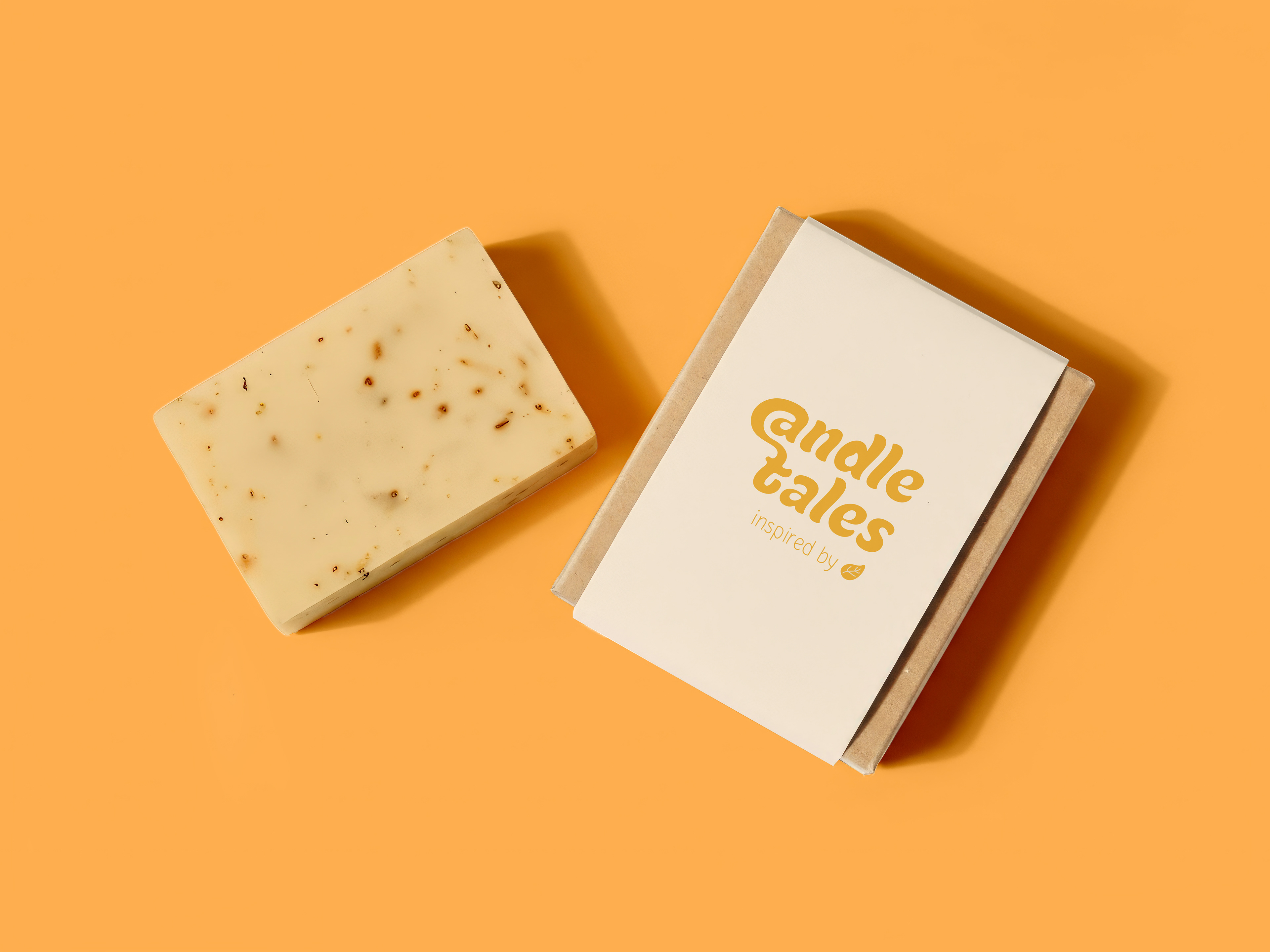
the logo was designed with soft, rounded letterforms and gentle curves, creating a friendly and human presence while preserving a distinctive and contemporary personality.
the flowing shapes reflect the movement of a flame, the softness of melted wax and the calm atmosphere created by candlelight.
the colour palette combines warm yellows, muted pinks and natural neutral tones, inspired by light, warmth and the comforting rituals connected with scented products.
the typography balances playfulness with refinement, allowing the identity to feel approachable, expressive and recognisable without losing its premium character.
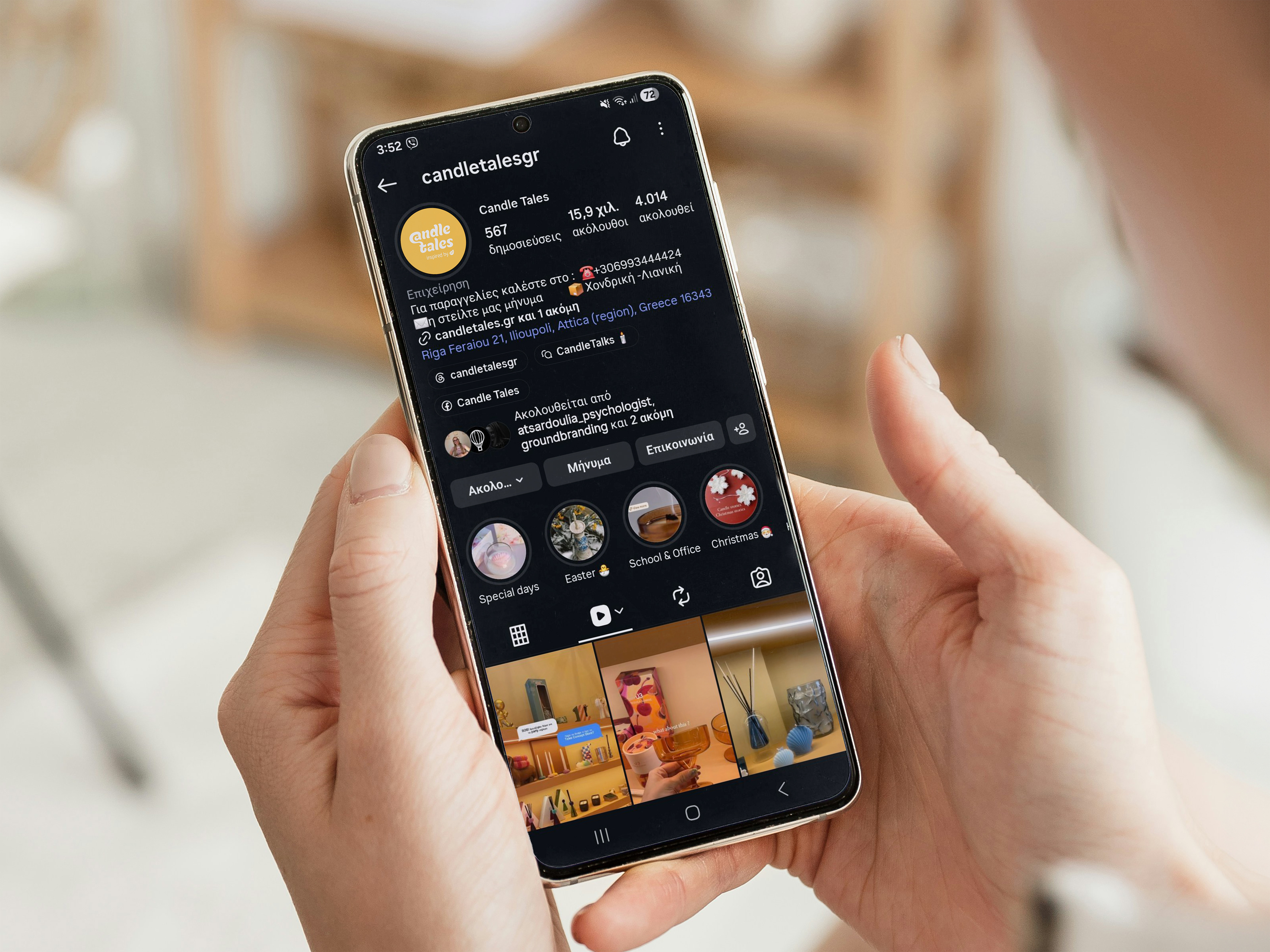
from candles and handmade soaps to packaging, printed materials and social media, the visual system creates a consistent experience across both physical and digital applications.
a contemporary identity built around one simple idea:
every scent holds a feeling, a memory and a story waiting to be told.