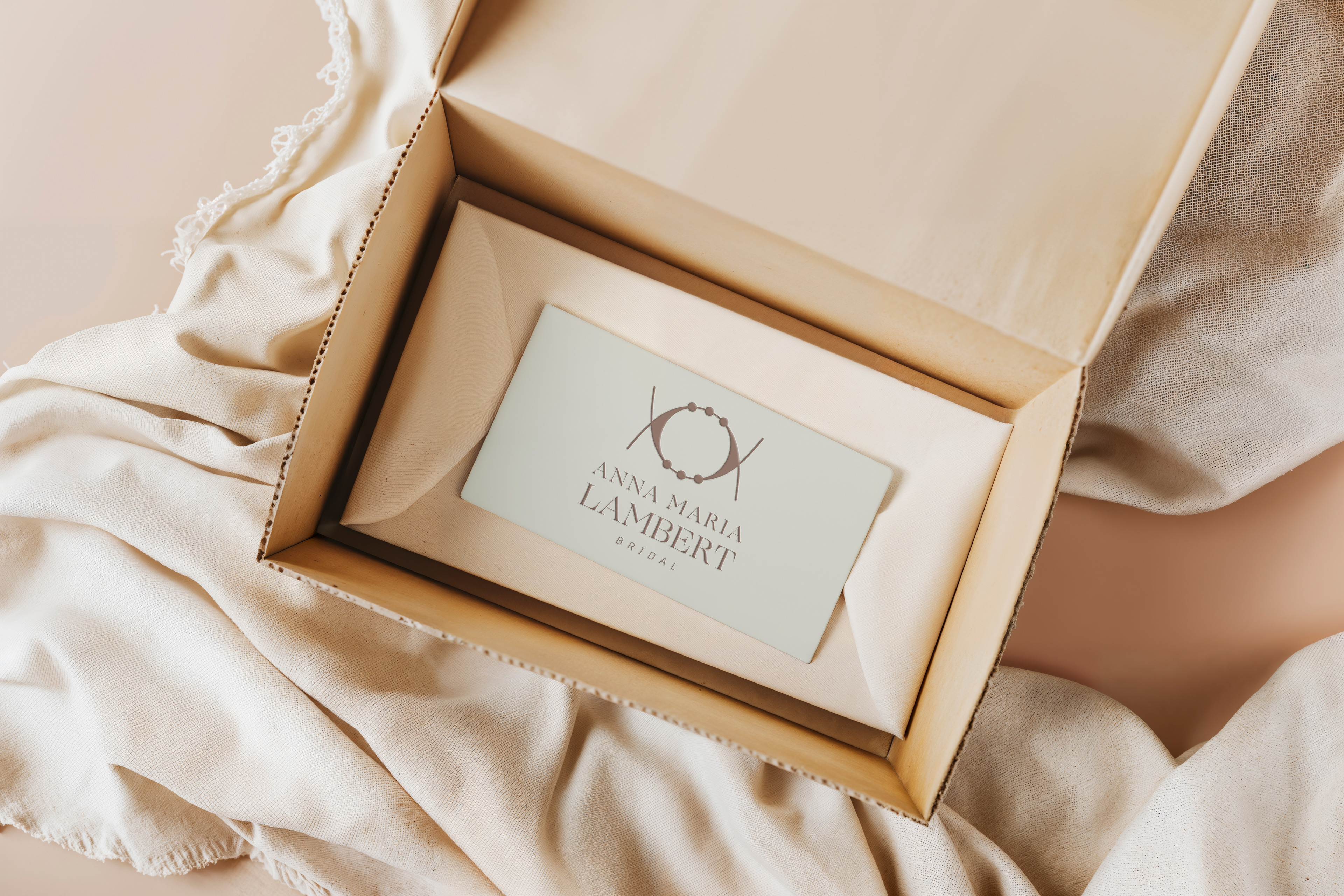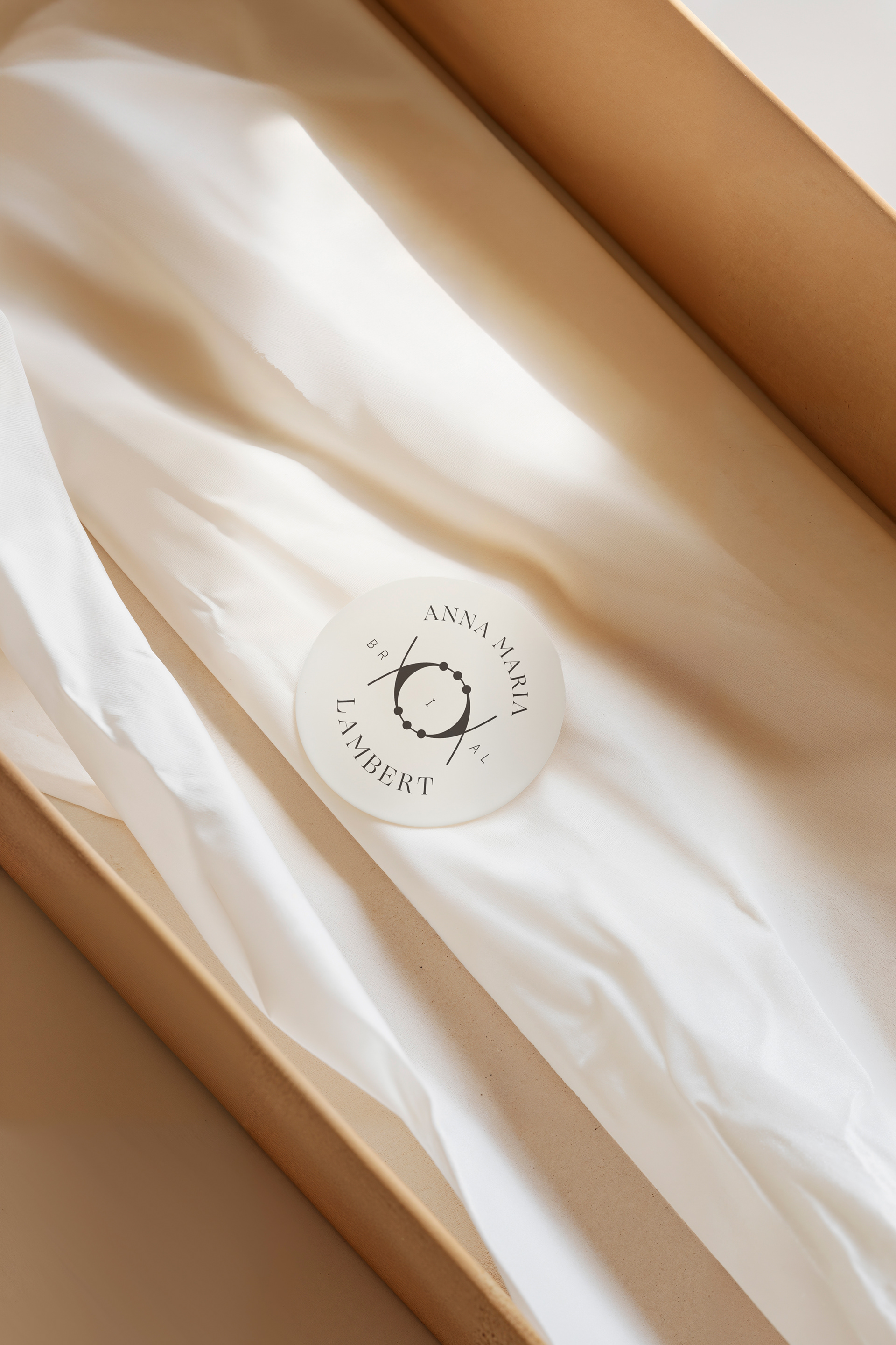
anna maria lambert bridal’s rebranding was developed as an alternative visual interpretation of the brand’s refined, handcrafted and deeply symbolic character.
the aim was not to replace its existing identity, but to explore how it could evolve through a more contemporary luxury bridal direction, while preserving its elegance and timeless appeal.
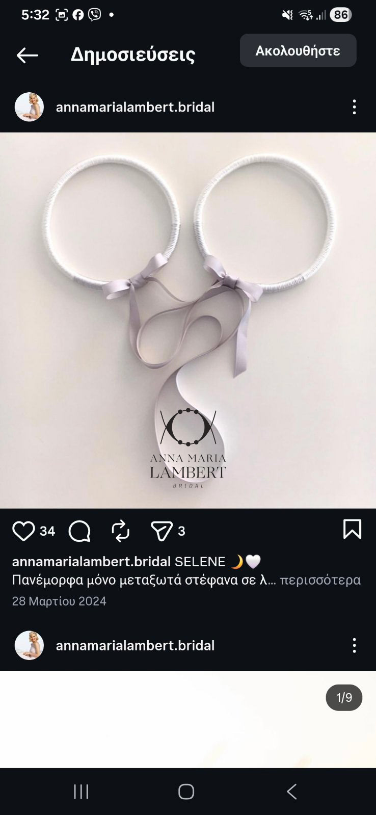
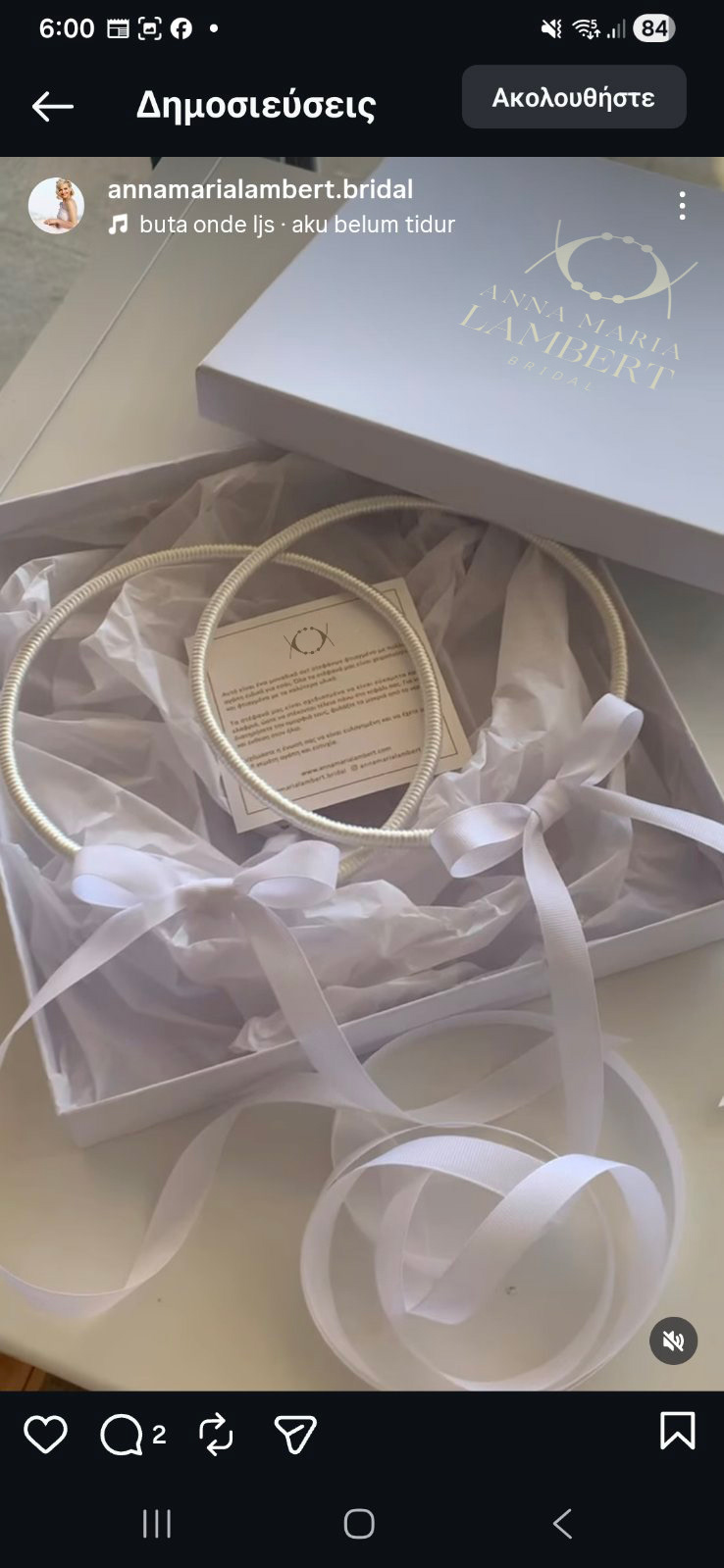
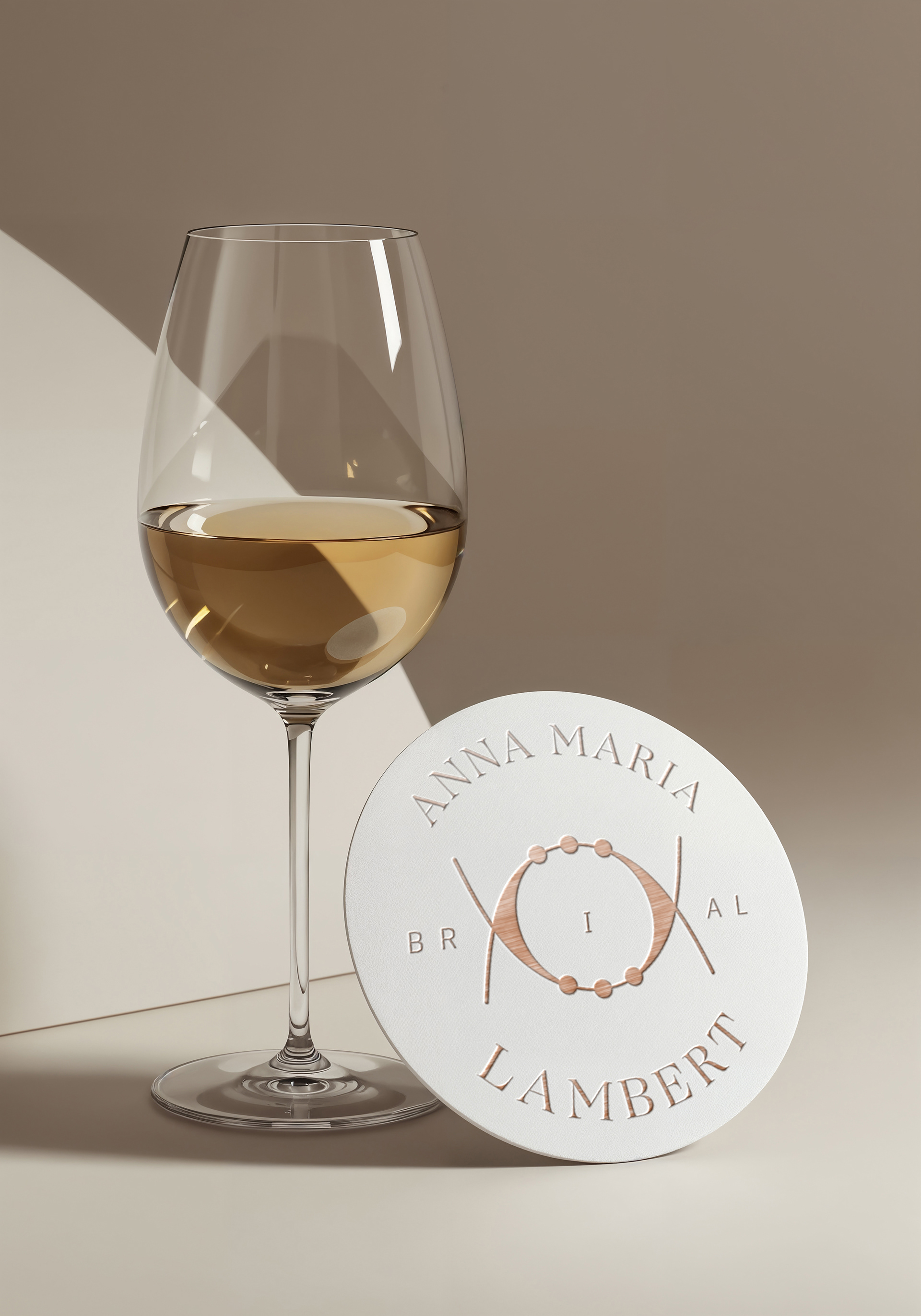
the symbol was directly inspired by the handcrafted wedding crowns that lie at the heart of the brand.
its circular form represents unity, commitment and continuity, while the delicate details reflect the craftsmanship, care and individuality behind every creation.
the composition transforms a meaningful ceremonial object into a contemporary and distinctive visual mark, connecting the identity with the emotional significance of the wedding ritual.
the colour palette combines soft neutrals, ivory and nude tones, creating a sense of understated luxury, femininity and refinement.
the typography balances classic elegance with a modern editorial character, allowing the brand to feel sophisticated, graceful and relevant.
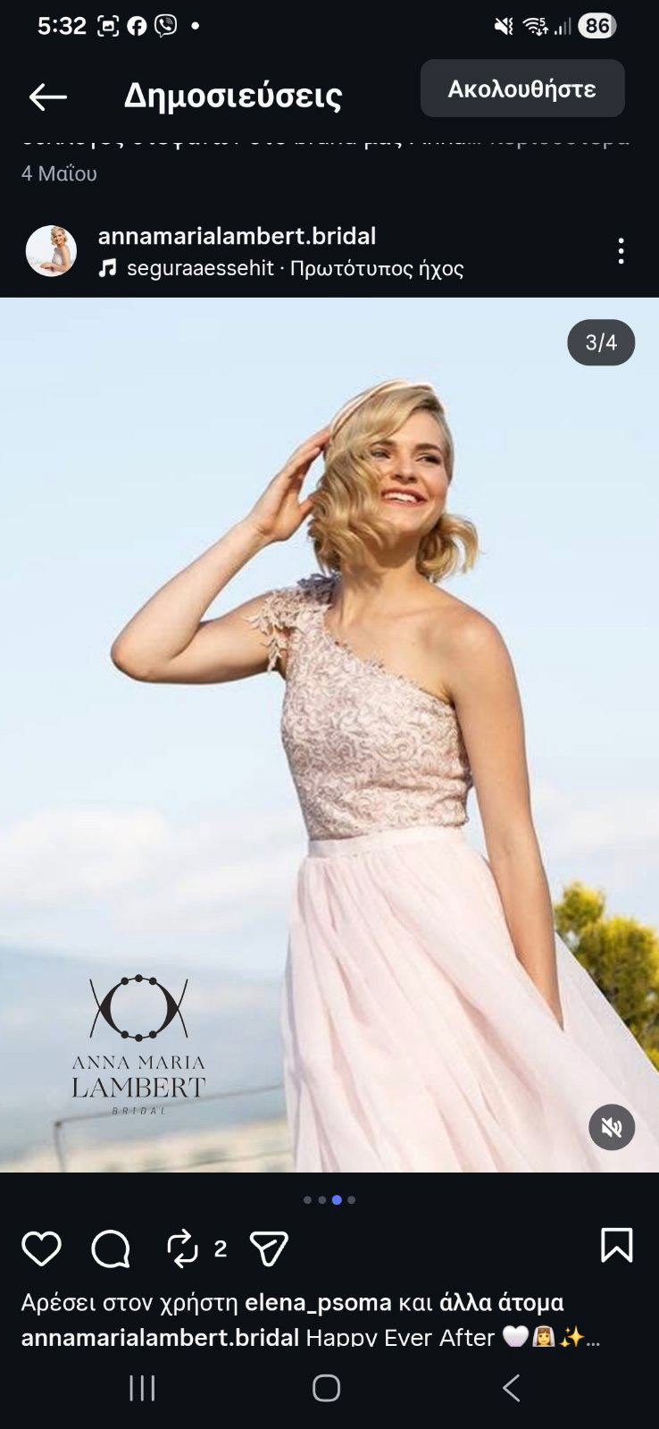
from packaging and printed details to social media and bridal applications, the visual system creates a consistent and elevated experience across every point of contact.
a timeless identity shaped around one central idea:
two individual paths, joined together in one meaningful and lasting bond.