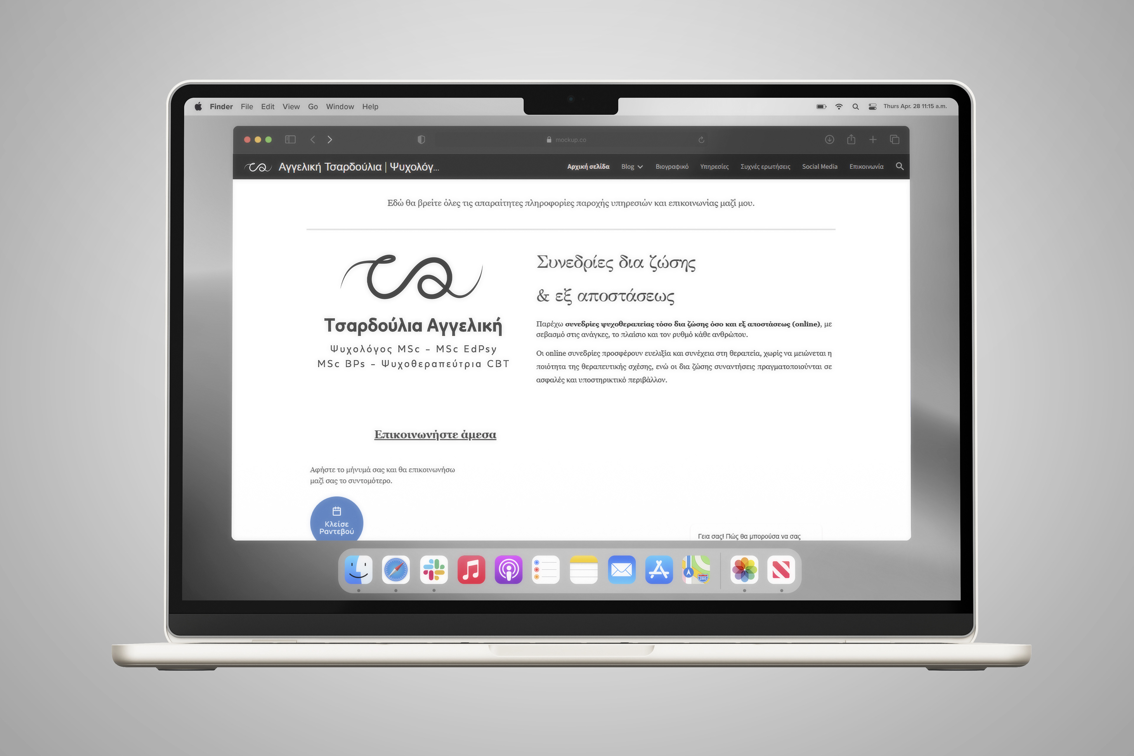
angeliki tsardoulia’s rebranding was developed as an alternative visual interpretation of her existing personal brand.
the aim was not to replace its identity, but to explore how it could evolve through a more contemporary, cohesive and recognisable visual language.
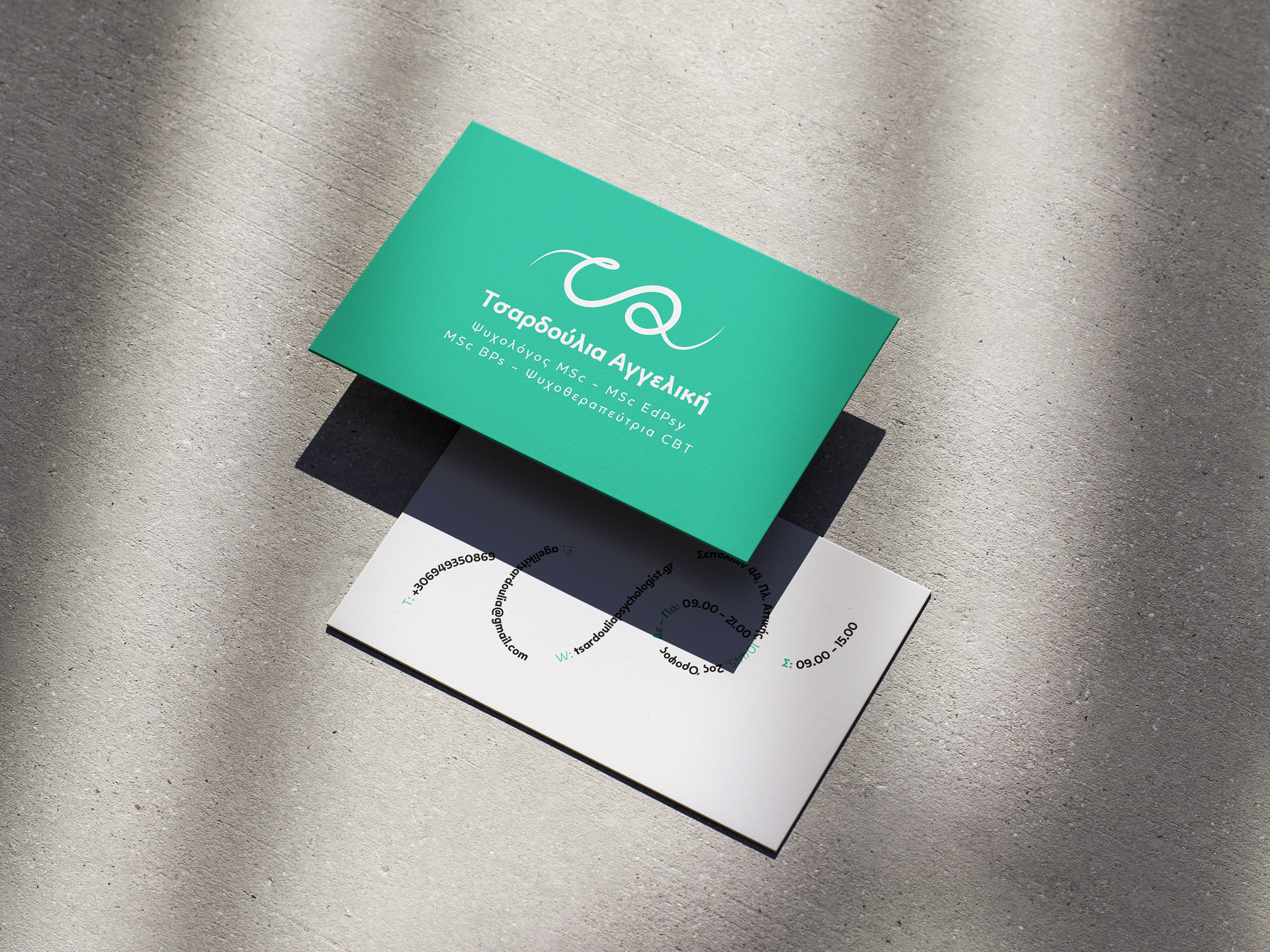
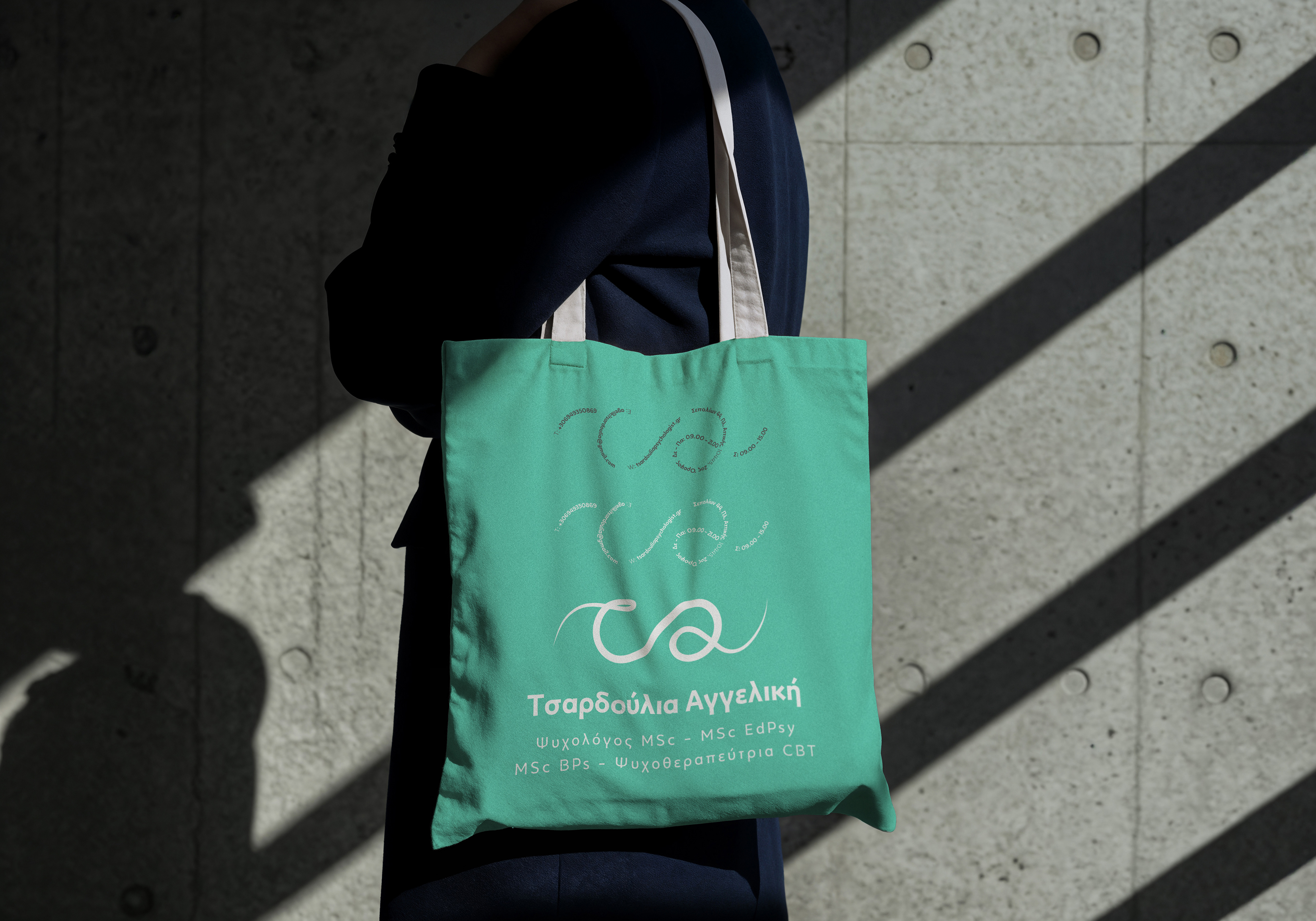
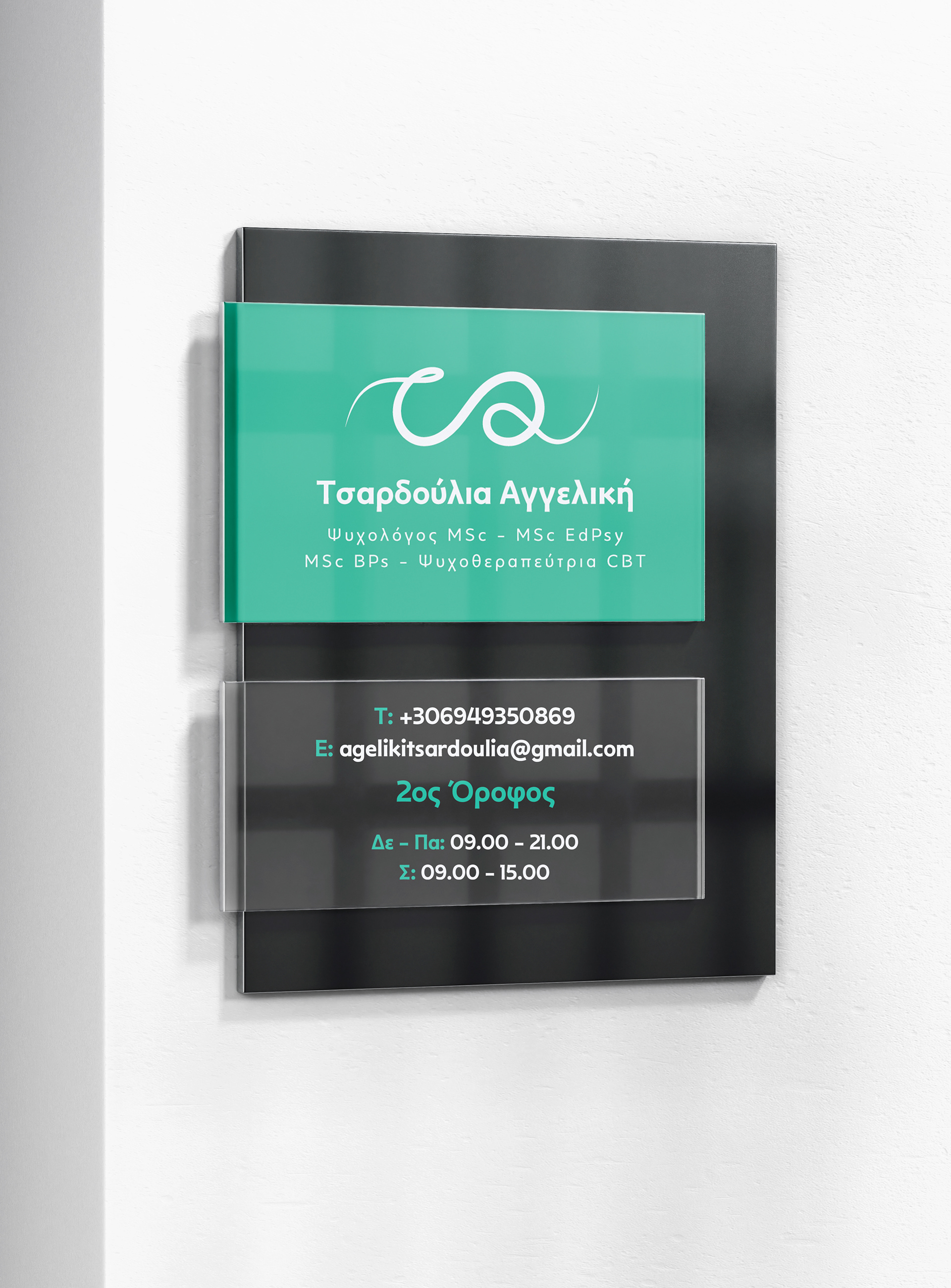
the symbol was designed around the initials of her name, maintaining a connection with the logic of the original identity.
its continuous form develops from left to right, symbolising movement, personal growth and the gradual process of transition that takes place through psychotherapy.
the colour palette combines calm and professional tones, creating a feeling of trust, emotional balance and reassurance.
the typography was selected to bring together warmth and clarity, allowing the identity to feel approachable without losing its professional character.
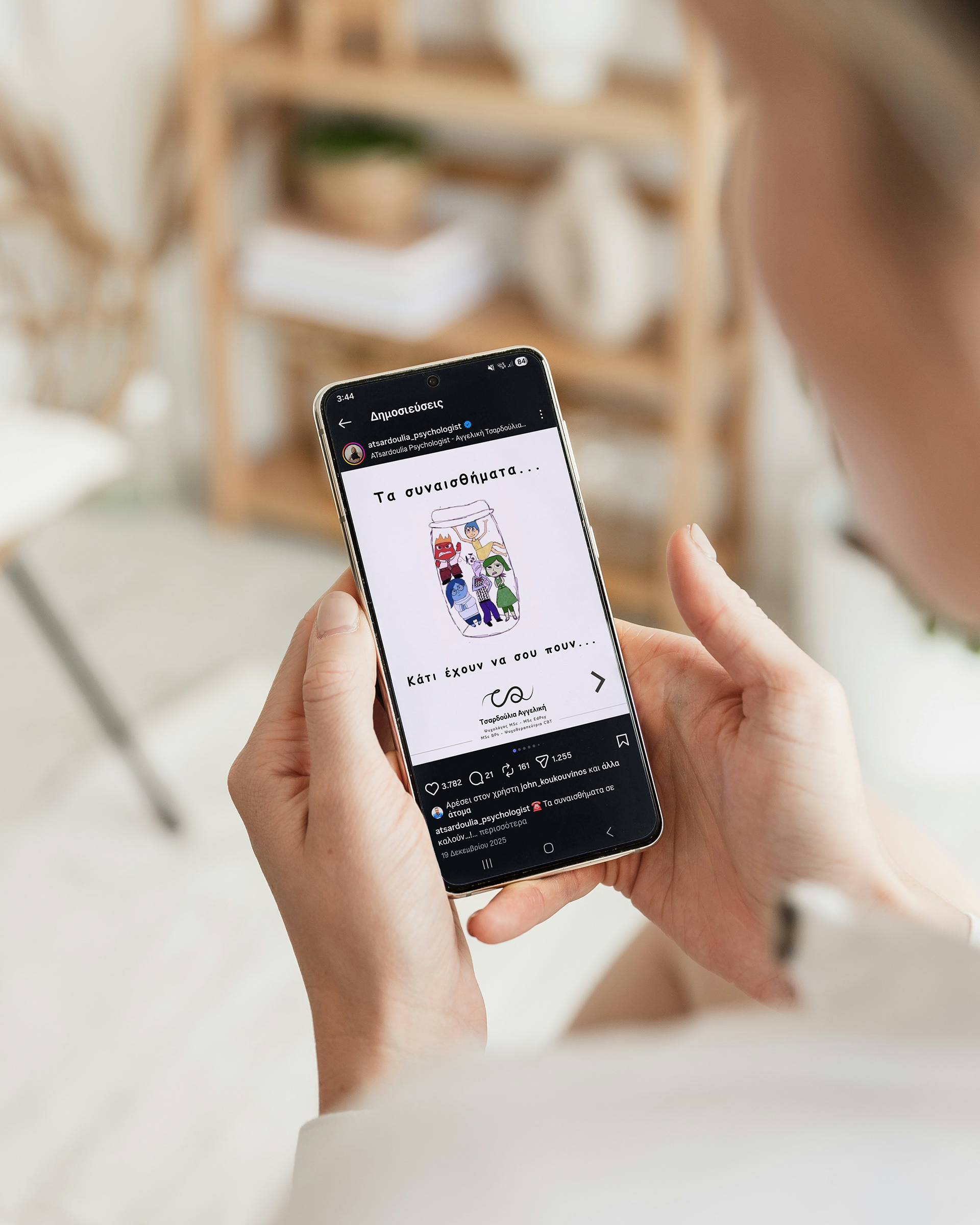
from business cards and office signage to social media and digital applications, the system creates a consistent presence across every point of communication.
a visual identity shaped around one central idea:
growth is not an instant transformation, but a continuous and deeply personal process.