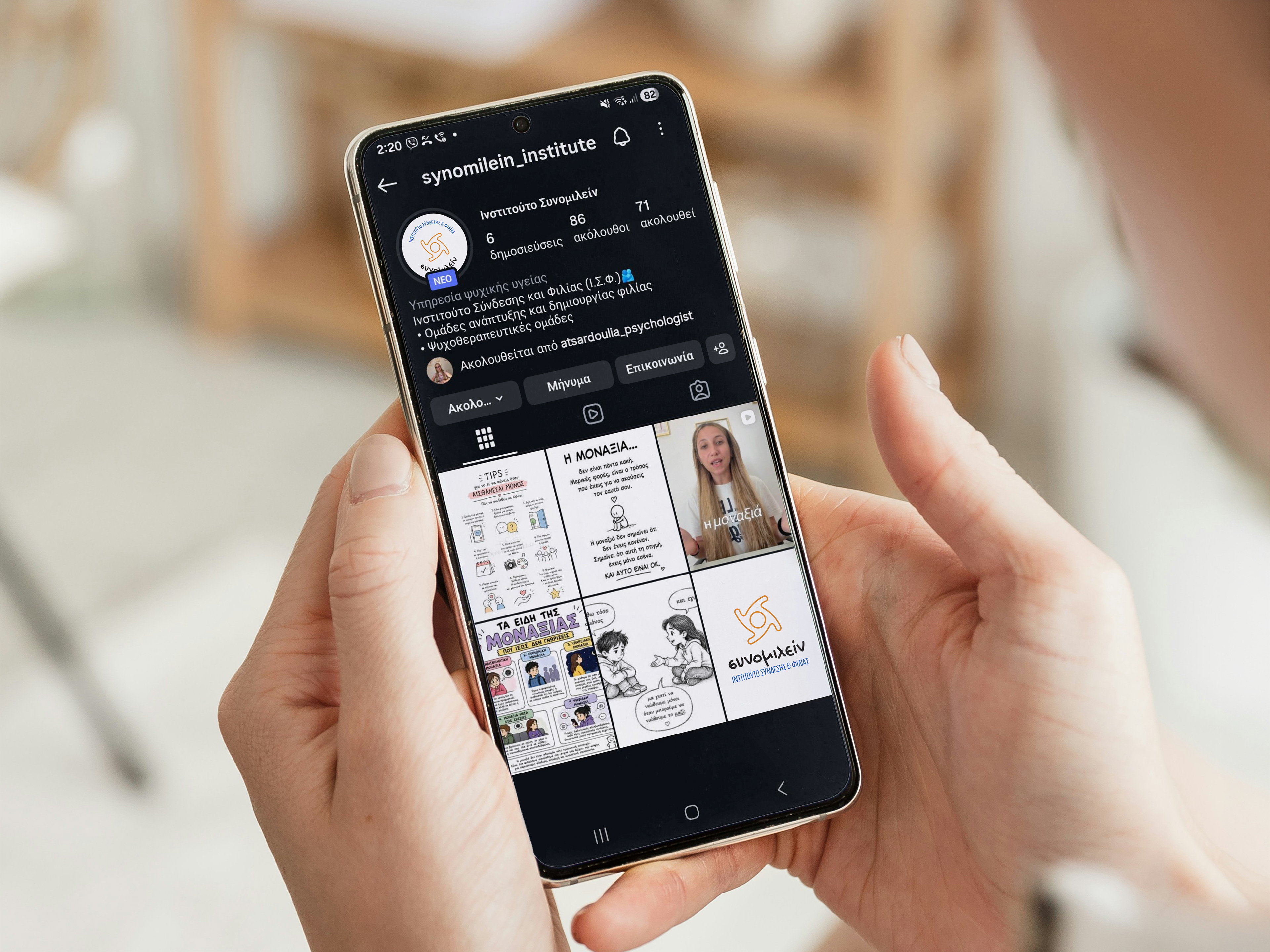
synomilein institute’s rebranding was developed as an alternative visual interpretation of its human-centred, inclusive and socially meaningful character.
the aim was not to replace its existing identity, but to explore how its core philosophy could be expressed through a more distinctive, coherent and recognisable visual language.
the concept was inspired by the institute’s fundamental values: human connection, communication, community, inclusion and the creation of a safe space in which meaningful relationships can develop.
the symbol is an abstract interpretation of the greek letter “σ”, establishing a direct connection with the name “synomilein”.
it is formed by four organic shapes arranged in a circular composition, representing individuals who come together, communicate and become part of a shared space of acceptance and belonging.
the circular structure expresses unity, continuity and protection, while also reflecting the trust and emotional safety required for genuine human connection.
the soft curves give the symbol an approachable and deeply human character, avoiding a rigid or impersonal visual language.
the colour palette combines blue tones, associated with calmness, trust and security, with warm orange accents that communicate optimism, openness and human closeness.
the custom-made typeface gb-stefania was selected for the name “synomilein”, bringing authenticity, immediacy and a strong human feel to the identity. a more technical condensed typeface was used for the descriptor “institute of connection & friendship”, balancing the warmth of the main wordmark with a structured, reliable and institutional presence.
from printed materials and stationery to digital communication and social media, the visual system creates a consistent identity that balances the human with the institutional, remaining friendly and accessible while also appearing contemporary, organised and recognisable.
a contemporary brand identity built around one central idea:
meaningful human connection begins with communication, trust and a shared sense of belonging.