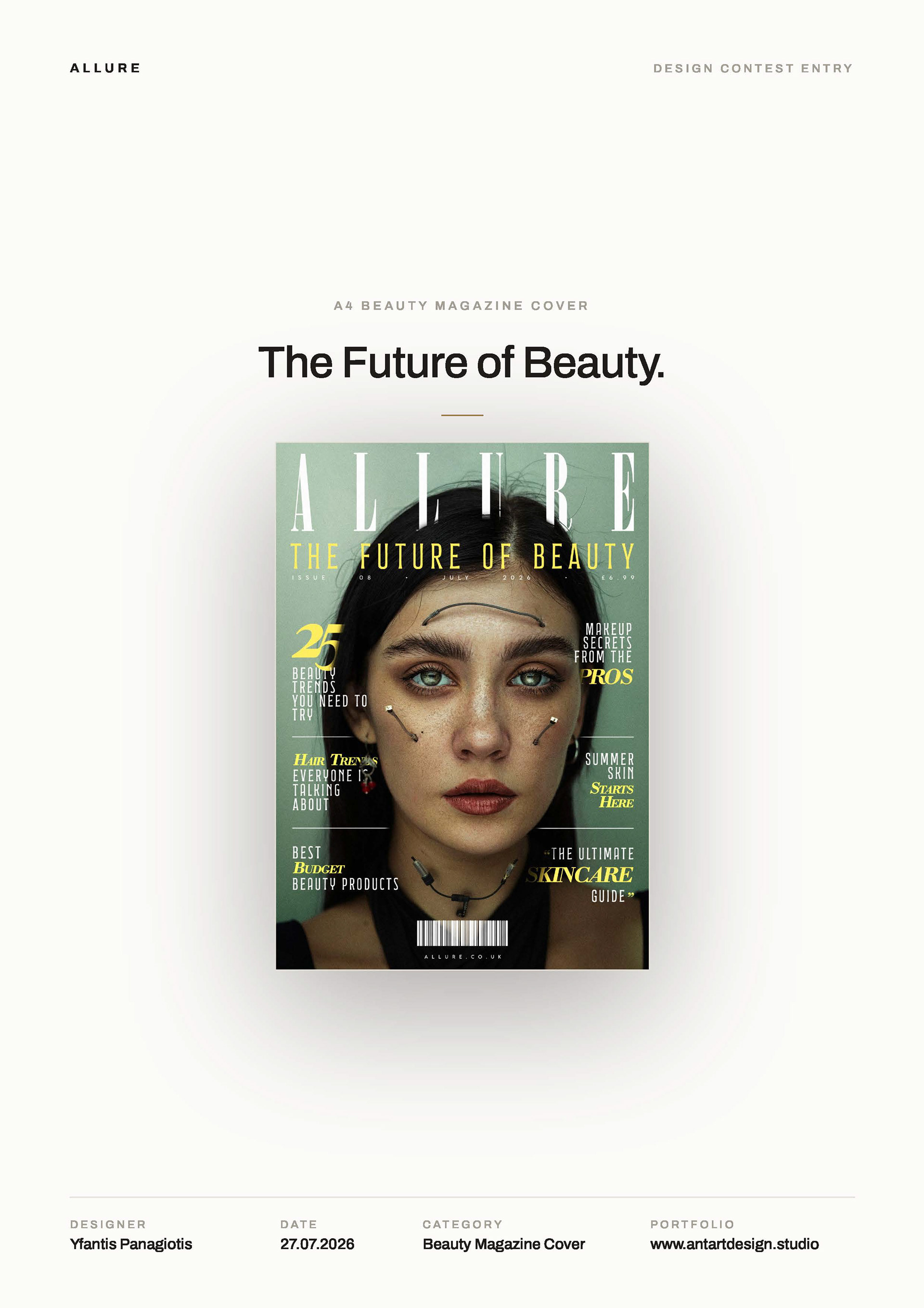
this cover was designed in response to a beauty magazine cover design contest held by yes i'm a designer community (www.yesimadesigner.com)
the brief asked for a premium, contemporary beauty cover. the main cover line was already there — the future of beauty — so we took it literally.
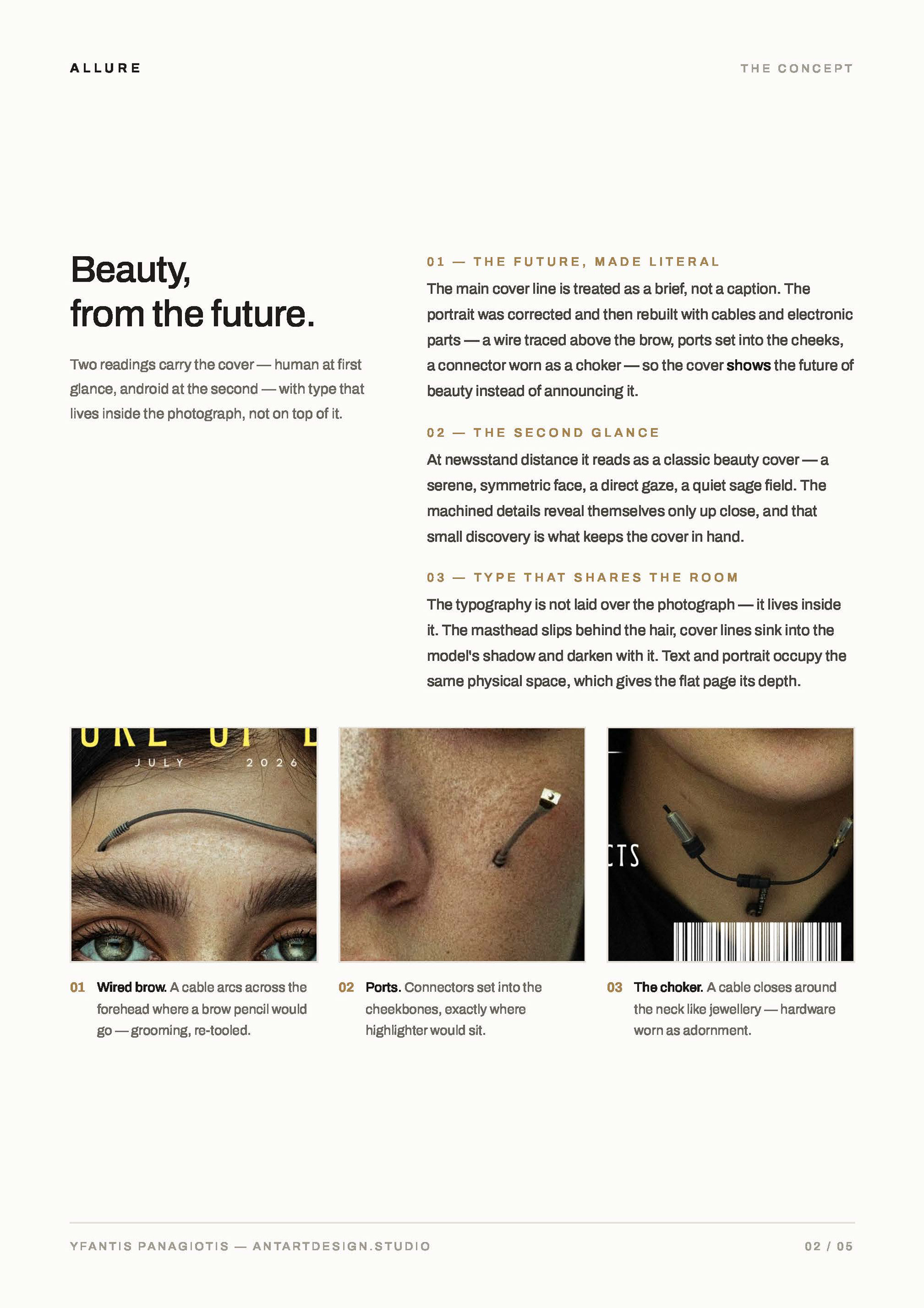
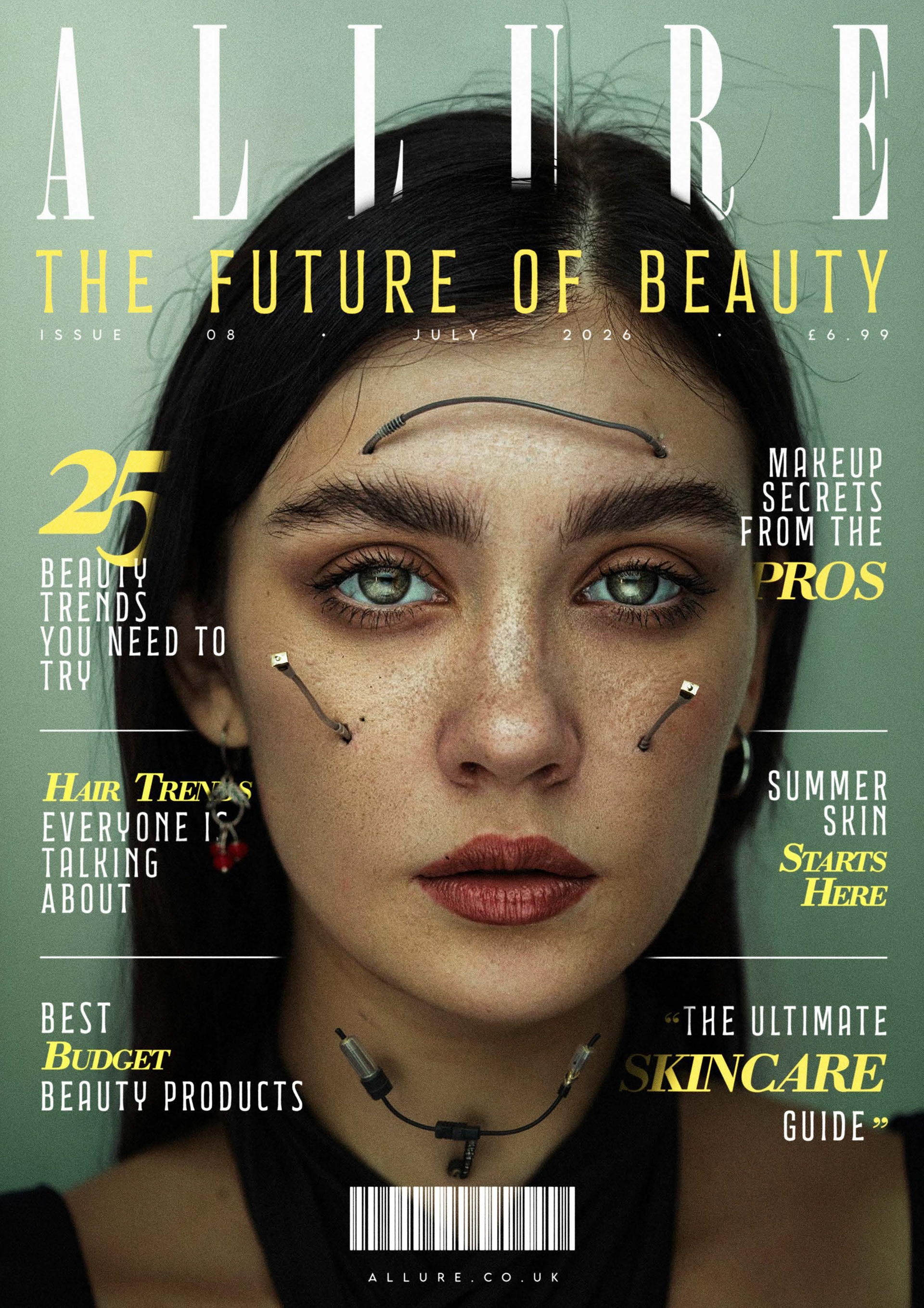
instead of announcing the future, the cover shows it. the portrait was corrected and then rebuilt: a wire traced above the brow where a pencil would go, connector ports set into the cheekbones where highlighter would sit, a cable closed around the neck like a choker. grooming, re-tooled.
human at first glance, android at the second.
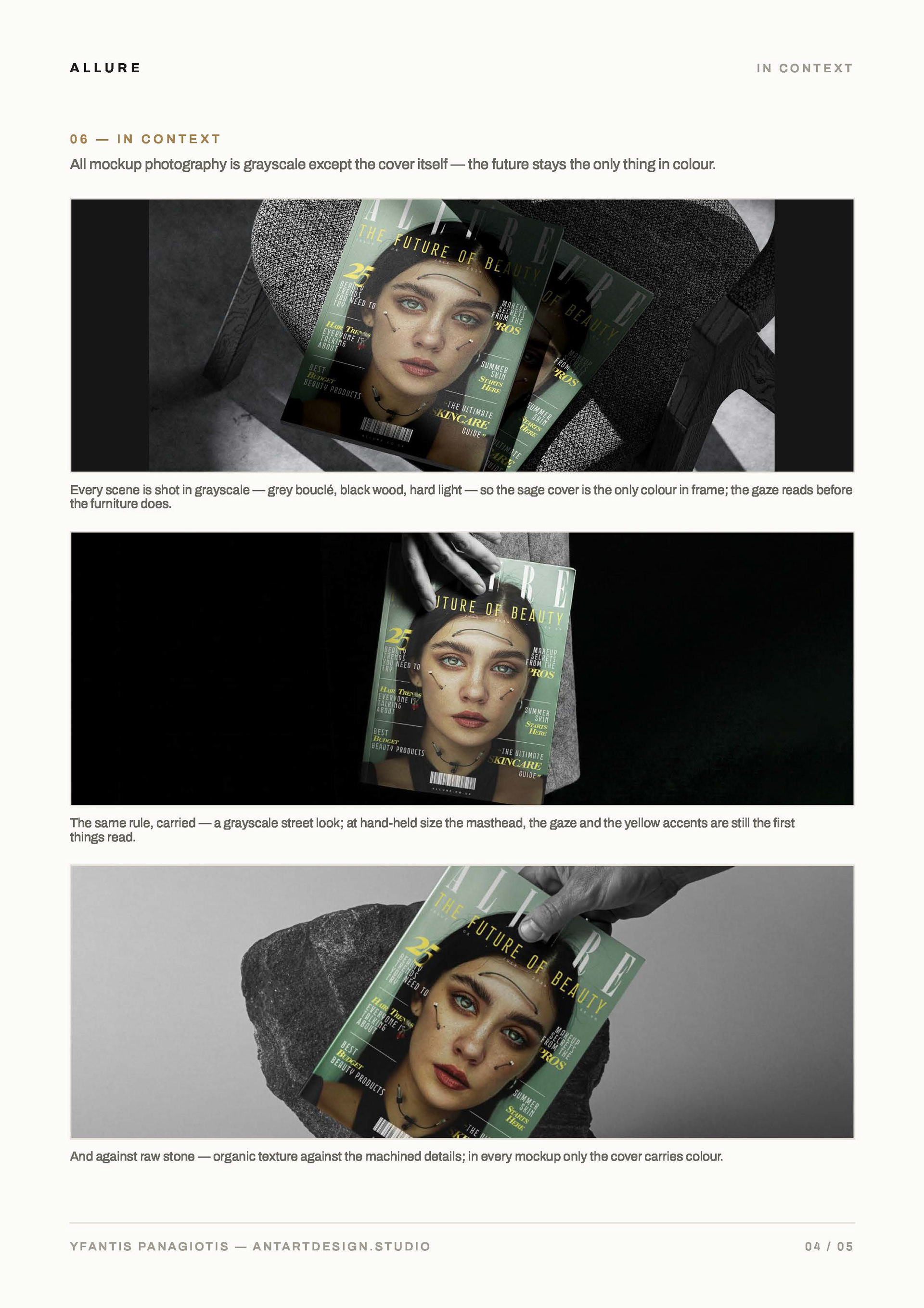
from newsstand distance it reads as a classic beauty cover — a serene, symmetric face, a direct gaze, a quiet sage field. the machined details reveal themselves only up close, and that small discovery is what keeps the cover in hand.
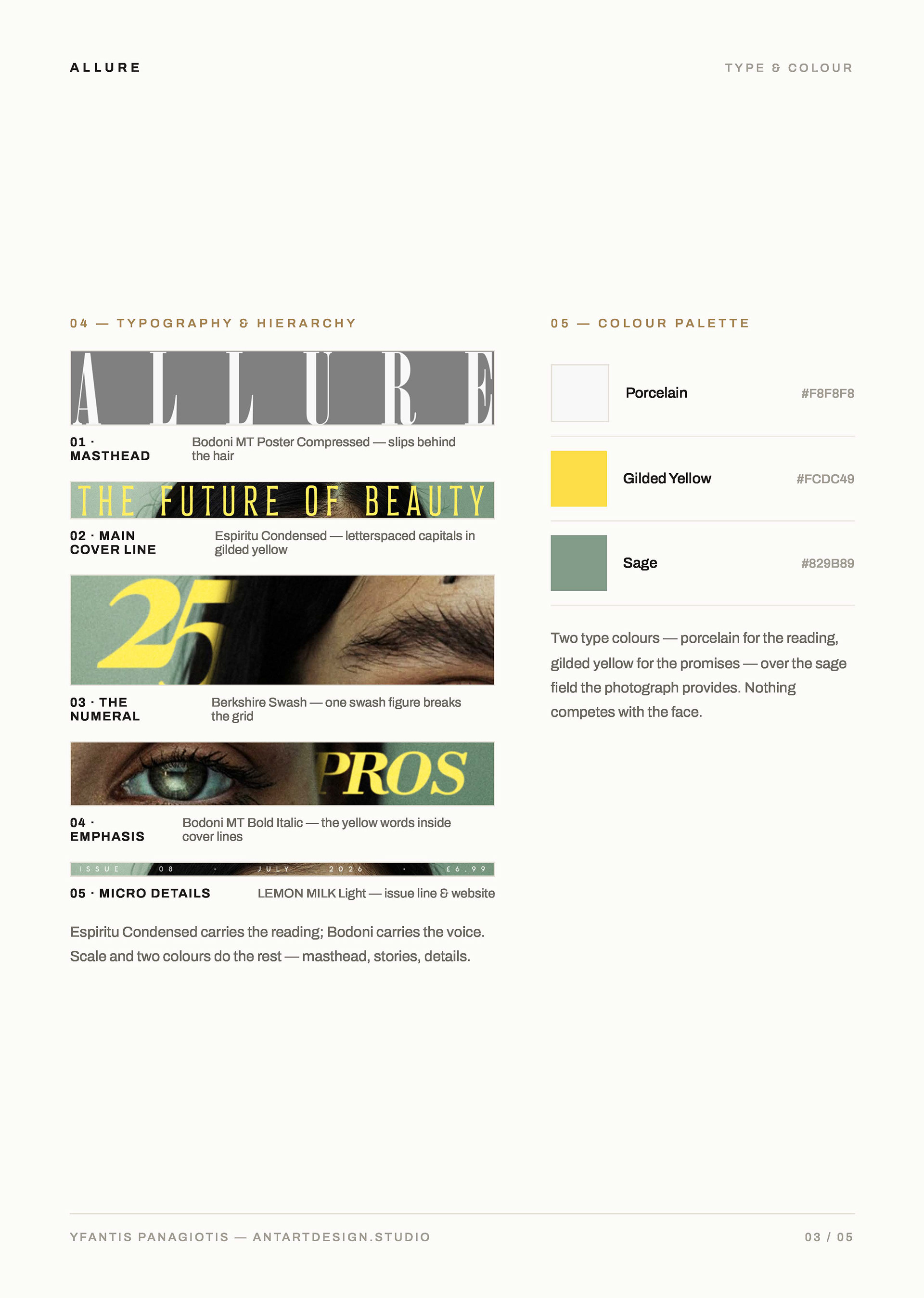
the typography lives inside the photograph, not on top of it: the masthead slips behind the hair, cover lines sink into the model's shadow and darken with it. text and portrait share the same physical space, and that's what gives a flat page its depth.
two type colours only — porcelain and gilded yellow — over the sage the photograph already had.
nothing competes with the face.