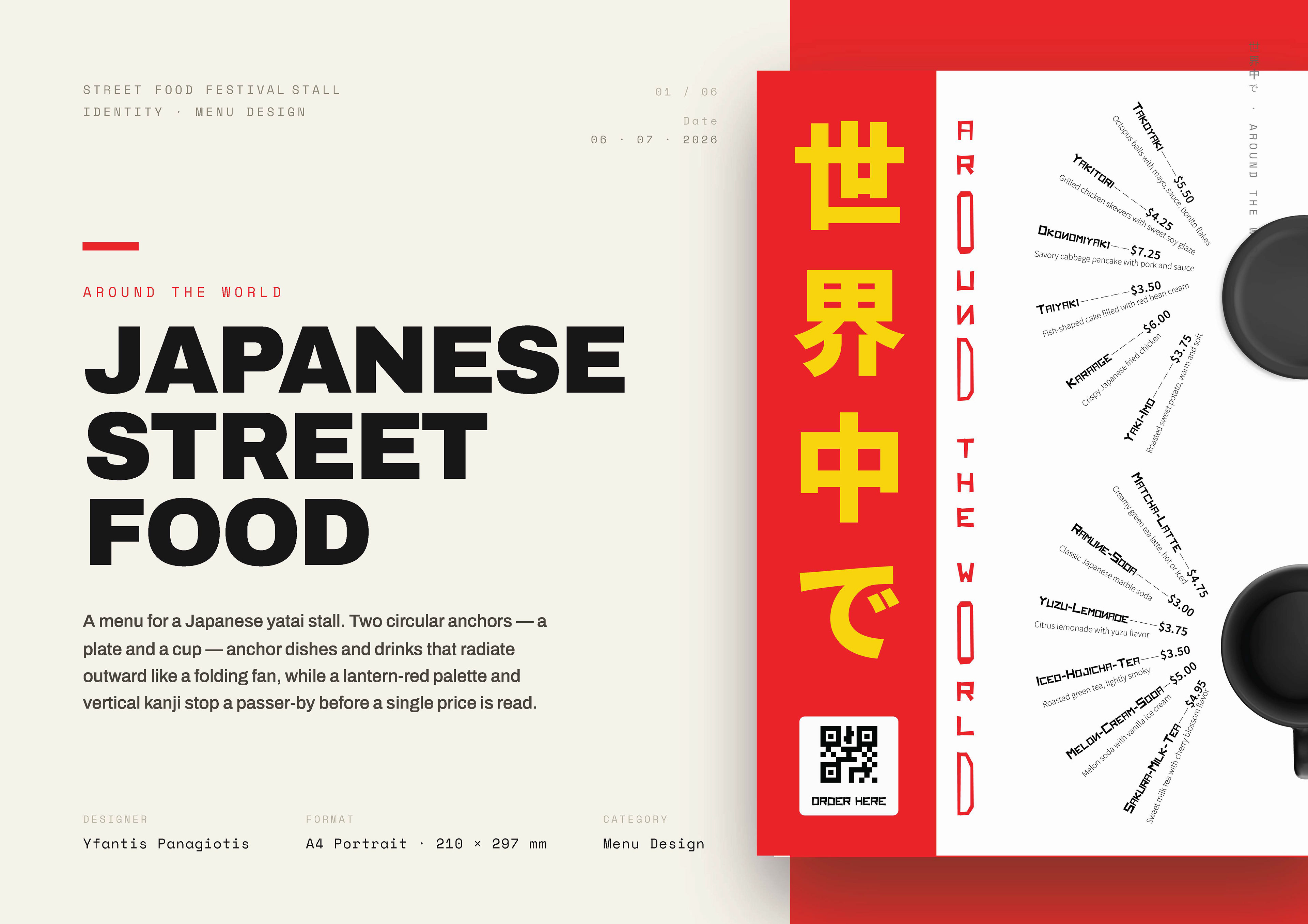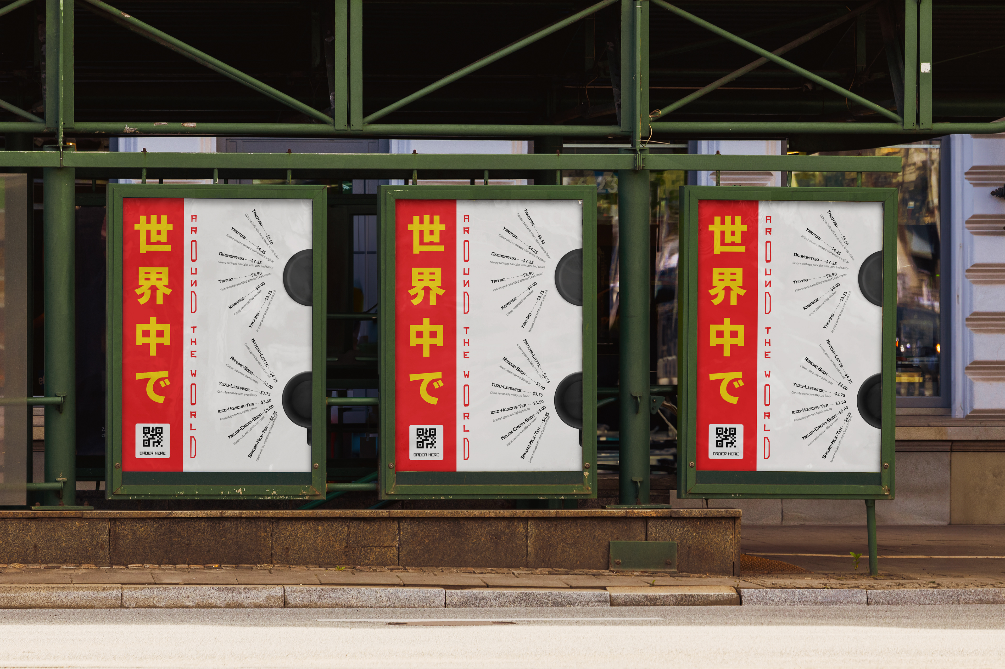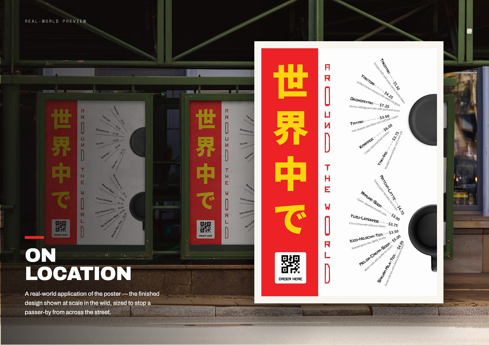
this poster was designed in response to a street food menu design contest held by yes i'm designer community (www.yesimadesigner.gr)
we chose Japanese street food and the buzz of a yatai — the little stalls you find at festivals.
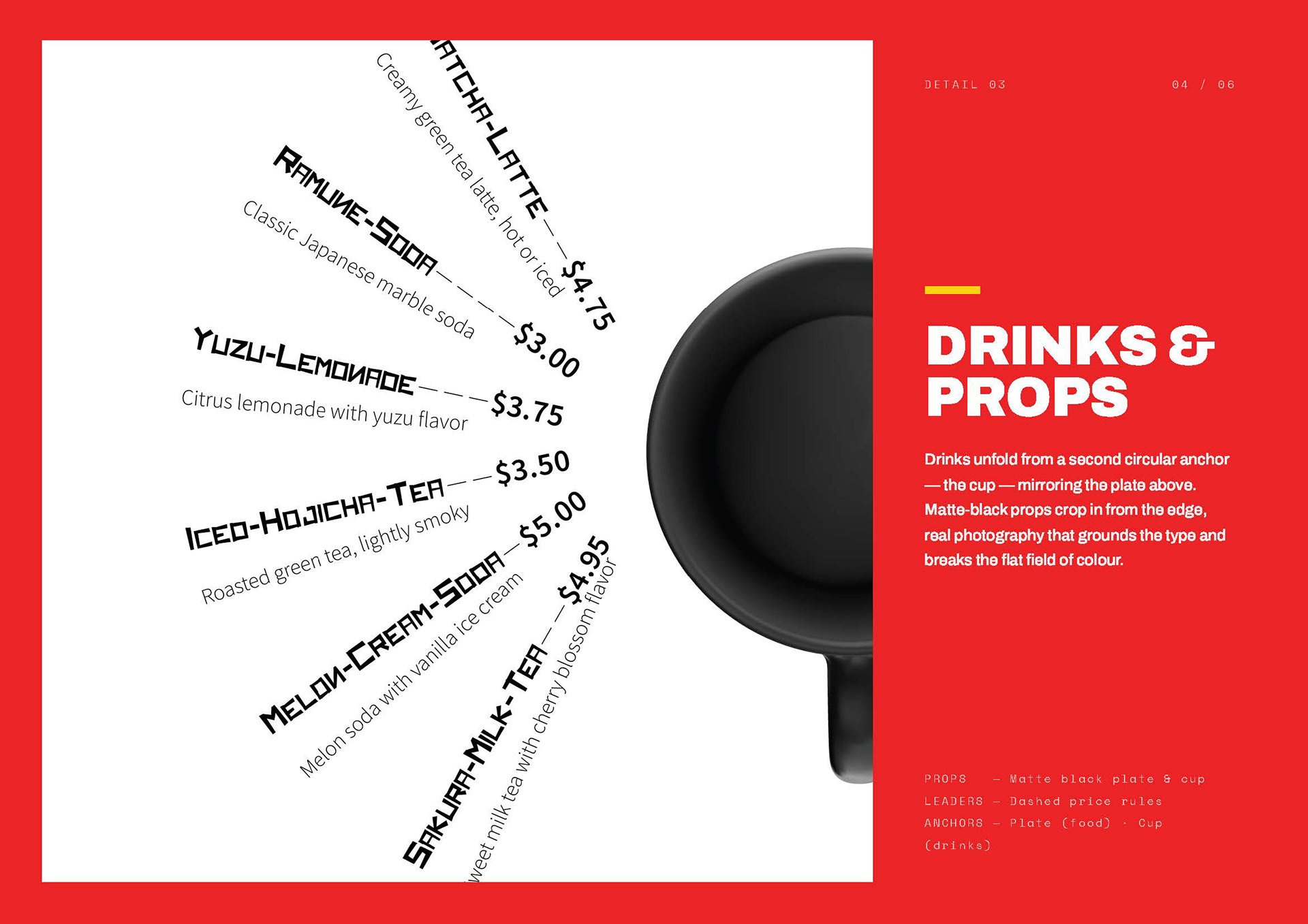
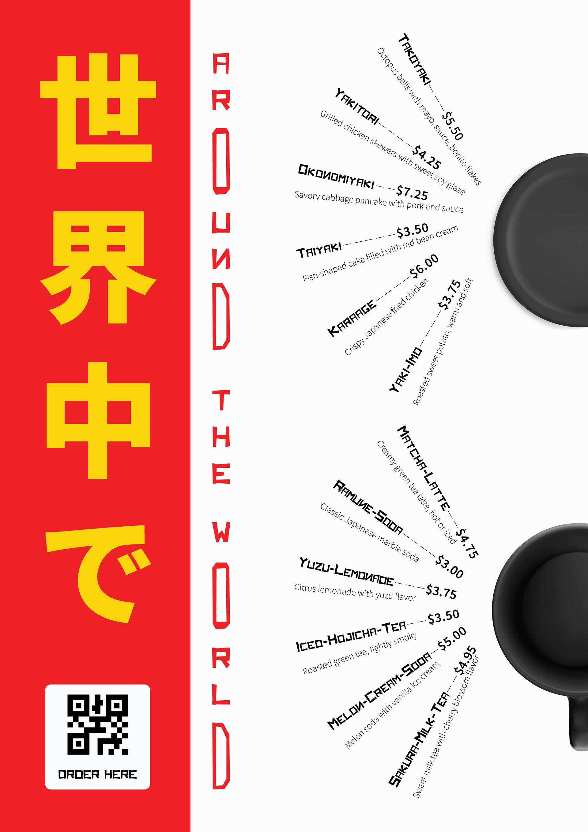
the menu is built around two circles: a plate and a cup.
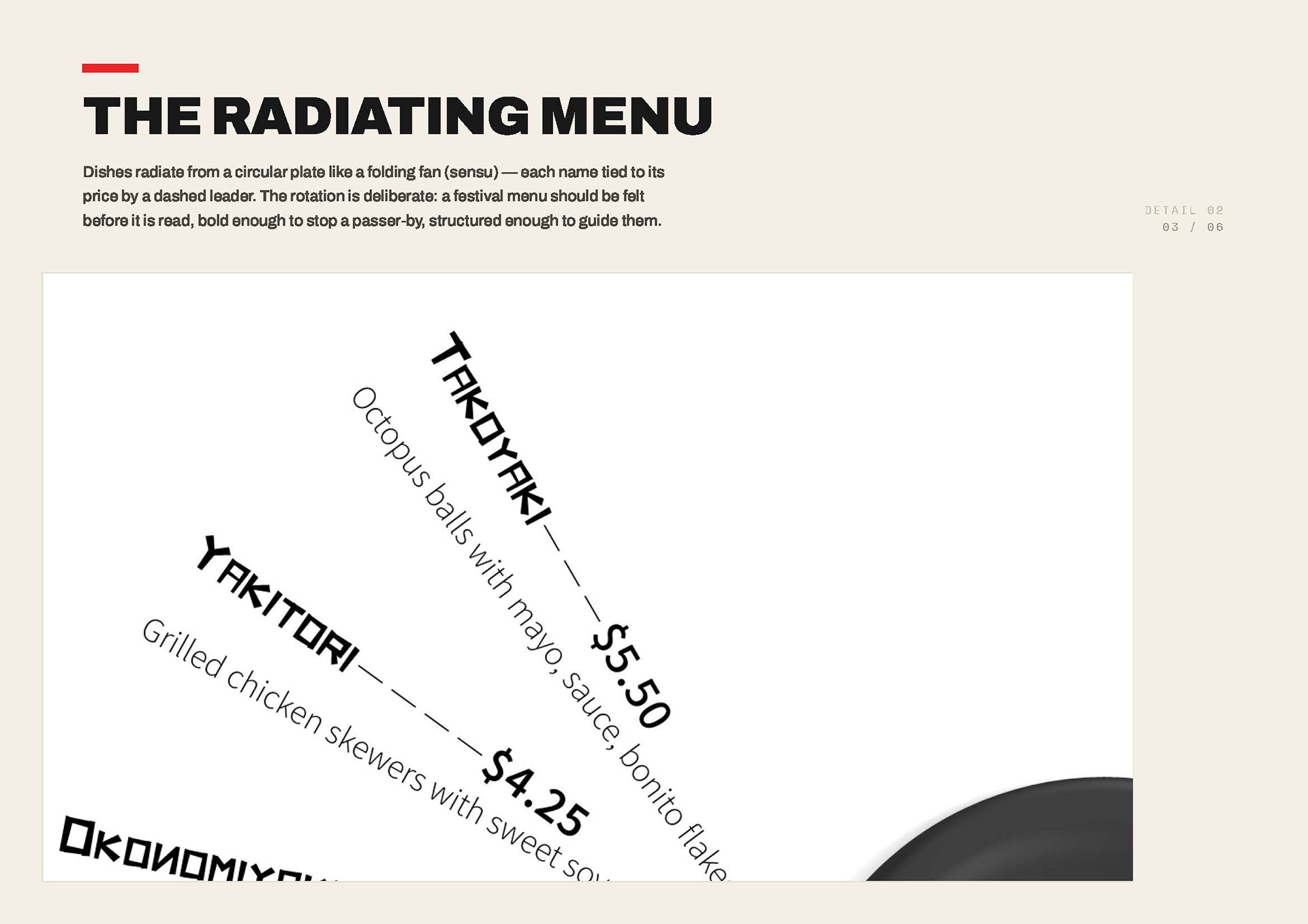
the dishes fan out from them, the way food is handed to you across the counter — a shape that also nods to a folding fan, so reading it feels like a small ritual.
food from the plate, drinks from the cup.
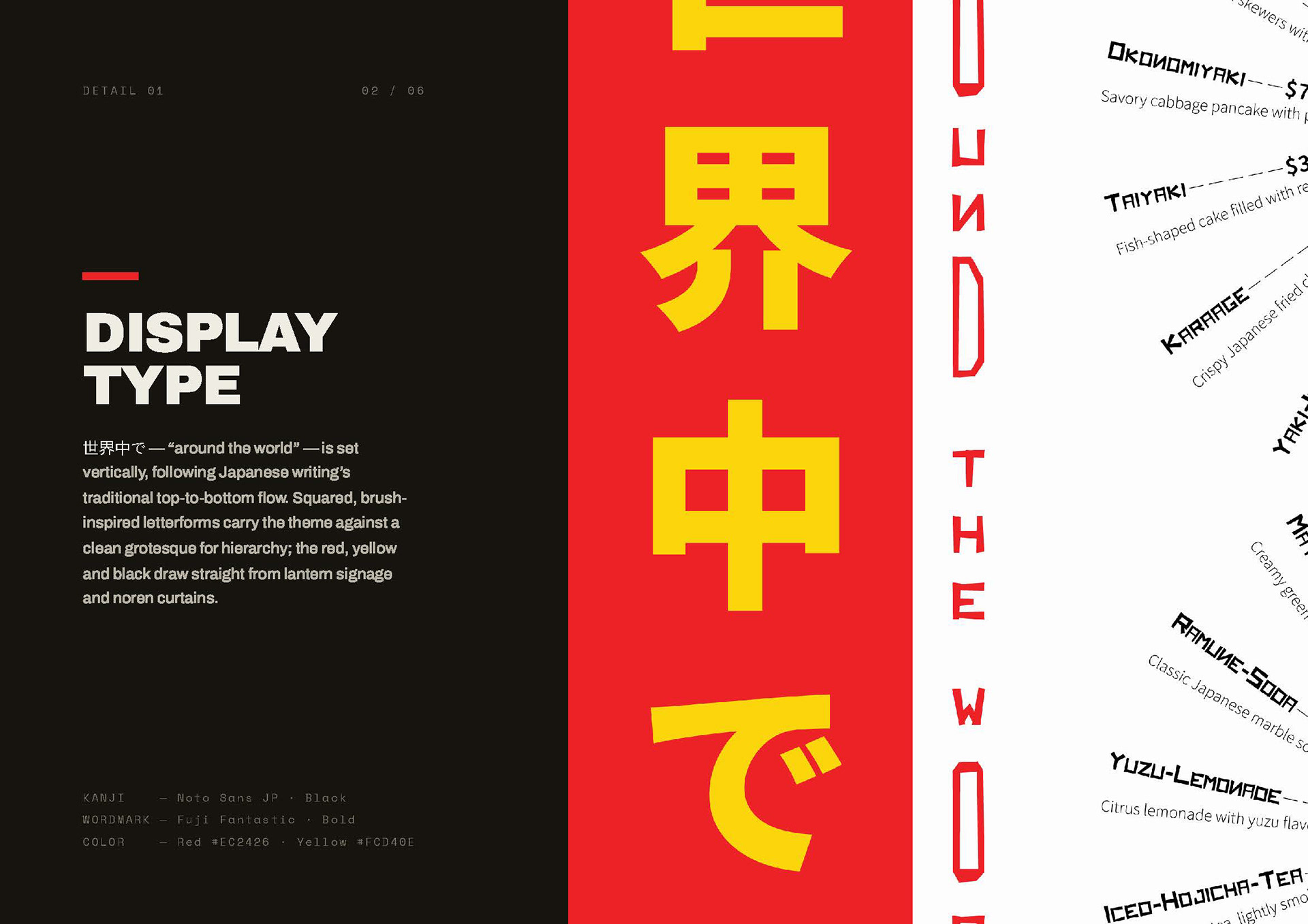
the words 世界中で ("all around the world") run top to bottom, as Japanese is traditionally written.
the red, yellow and black come from paper lanterns and the cloth curtains hung over stall doorways.
bold, brushy letters set the mood; a plain typeface keeps everything easy to follow.
the tilt is on purpose: a festival menu is felt before it's read — loud enough to catch your eye, clear enough to guide you.
the QR code stands in for how you'd really order at a stall today.