synomilein institute’s rebranding concept was developed as an alternative visual interpretation of its human-centred, inclusive and socially meaningful character.
rather than replacing the institute’s existing identity, the project explores how its philosophy could be translated into a more distinctive, coherent and recognisable visual language — one rooted in human connection, communication, inclusion and belonging.
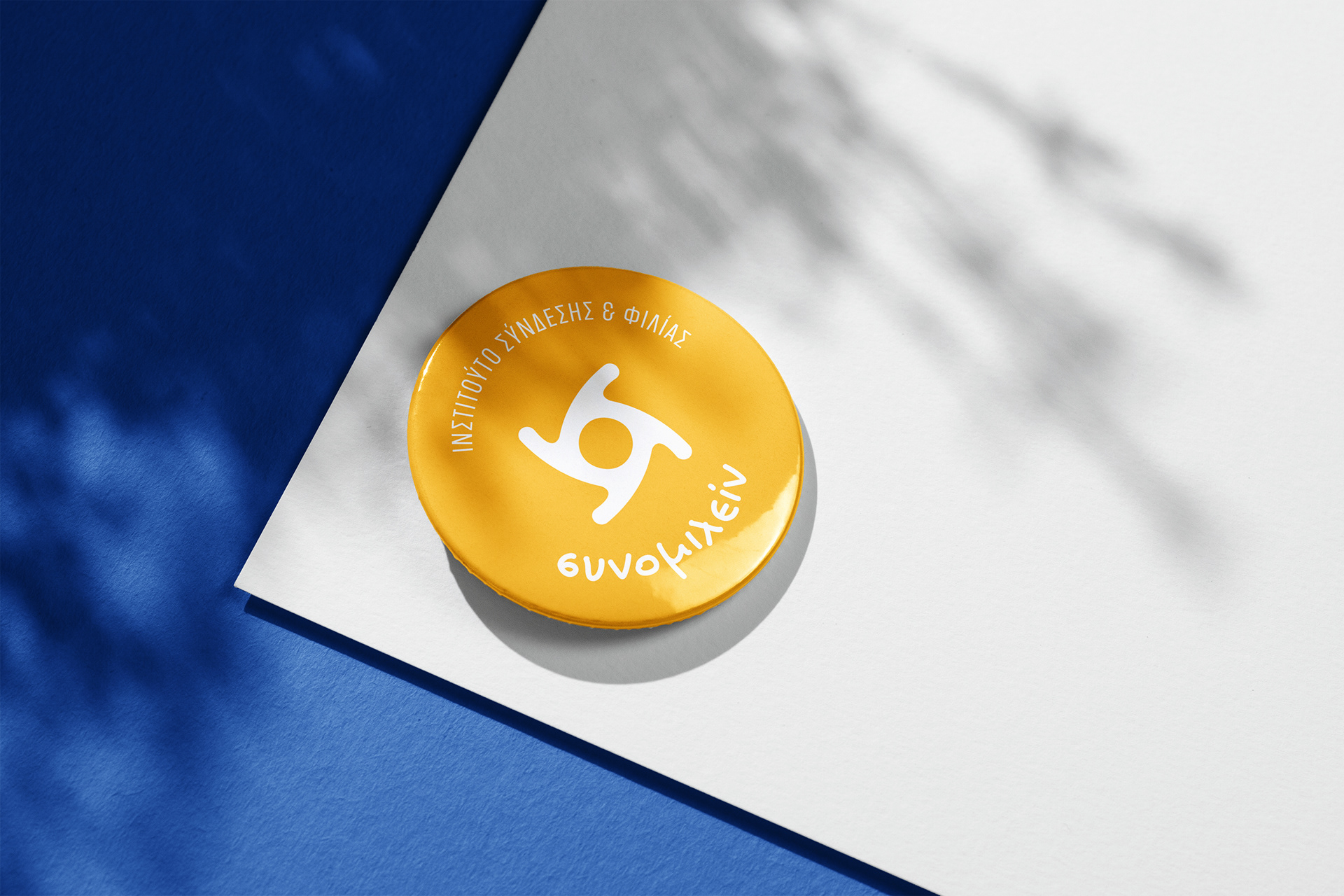
at the centre of the identity is an abstract interpretation of the greek letter “σ”, creating a direct visual link to the name “synomilein”. four organic forms come together in a circular composition, symbolising individuals meeting, communicating and becoming part of a shared space.
the circular structure expresses unity, continuity and protection, while the soft, fluid geometry gives the symbol an approachable and distinctly human character. together, these elements reflect the trust, openness and emotional safety that allow meaningful relationships to develop.
the colour palette combines calm blue tones with warm orange accents, balancing feelings of trust and security with optimism, openness and human warmth.
typography plays an essential role in reinforcing this character. for the “synomilein” wordmark, we selected gb stefania, a handcrafted typeface created by greek type designer george bourle in collaboration with stefania, whose authentic handwriting became the foundation of the typeface. its spontaneous and deeply personal quality introduces warmth, immediacy and individuality into the identity.
a condensed, more structured typeface was paired with it for the descriptor “institute of connection & friendship”, balancing the expressive nature of the main wordmark with clarity, reliability and a more institutional presence.
across print, stationery, digital communication and social media, the visual system creates a consistent brand world that feels warm yet structured, accessible yet distinctive.
a contemporary identity built around one central idea:
meaningful human connection begins with communication, trust and a shared sense of belonging.
—
project links & credits
rebranding concept & visual identity — @antartdesign.studio
synomilein institute — @synomilein_institute
type design — george bourle / @georgebourle
original handwriting & collaboration — @stefanie.aivalaki
synomilein institute — @synomilein_institute
type design — george bourle / @georgebourle
original handwriting & collaboration — @stefanie.aivalaki