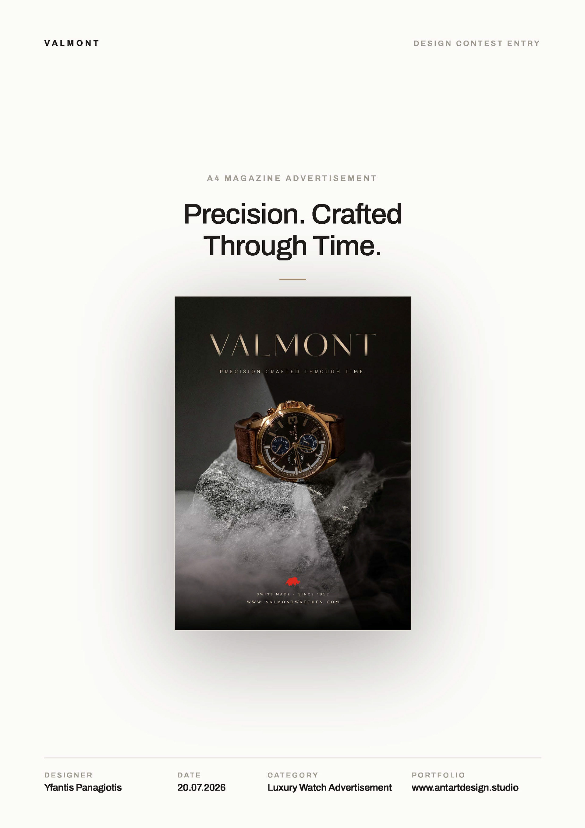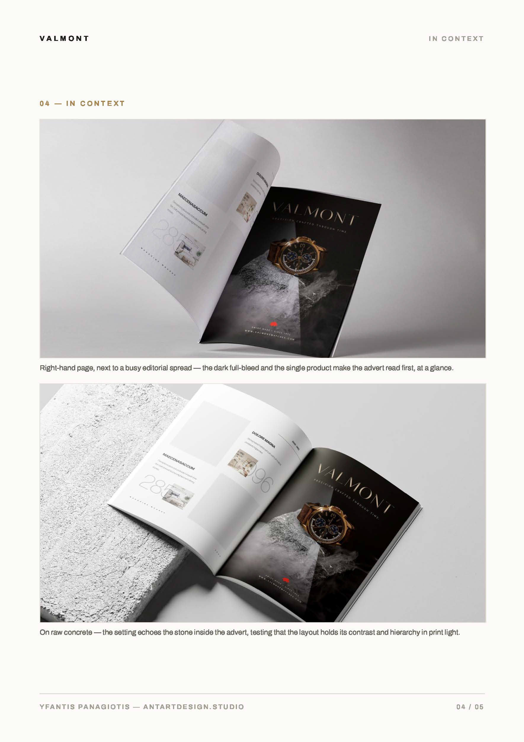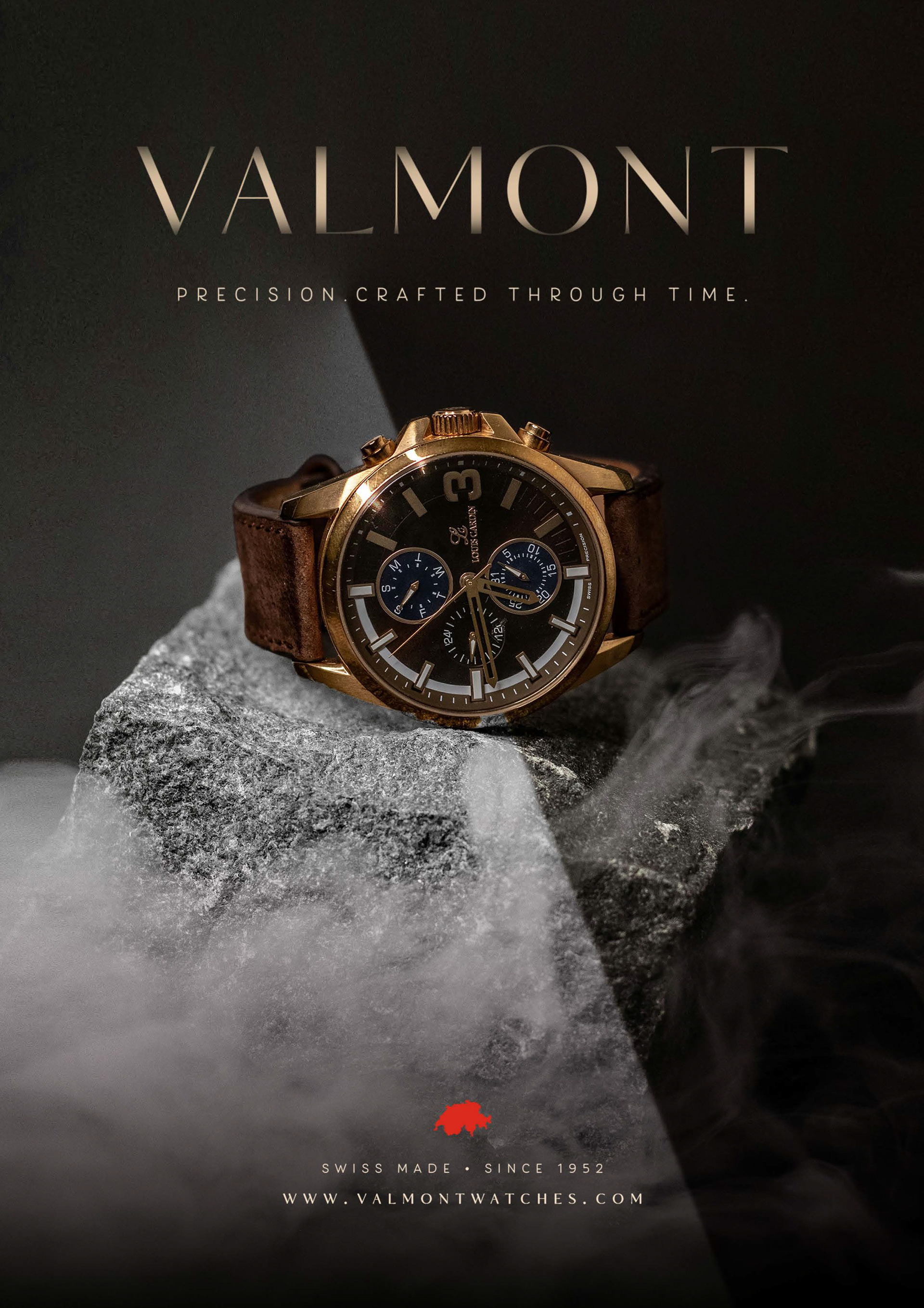
this advert was designed in response to a luxury watch advert design contest held by yes i'm a designer community (www.yesimadesigner.com) and was the community vote winner (⭐).
the brief asked for elegance, white space and a product-first layout — we chose to take the headline literally.
precision. crafted through time.
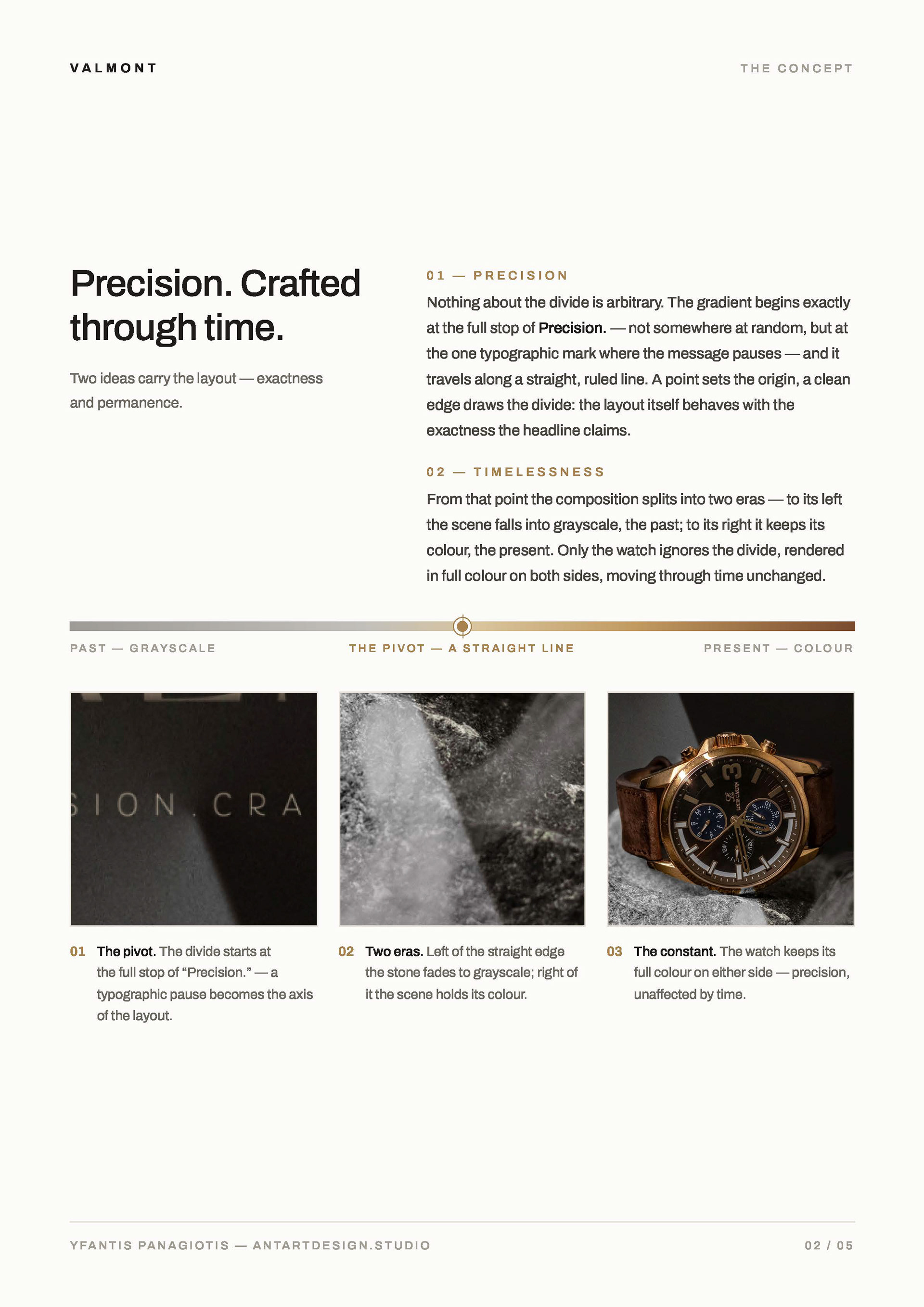
at the full stop between "precision." and "crafted" — the one typographic mark where the message pauses — a gradient begins and quietly splits the page in two.
to its left, the scene falls into grayscale: the past. to its right, it keeps its colour: the present.
nothing about the divide is arbitrary. a point sets the origin, a straight ruled line draws the edge — the layout behaves with the exactness the headline claims.
only the watch ignores the divide. it appears in full colour on both sides, one object moving through eras unchanged. timeless by design.
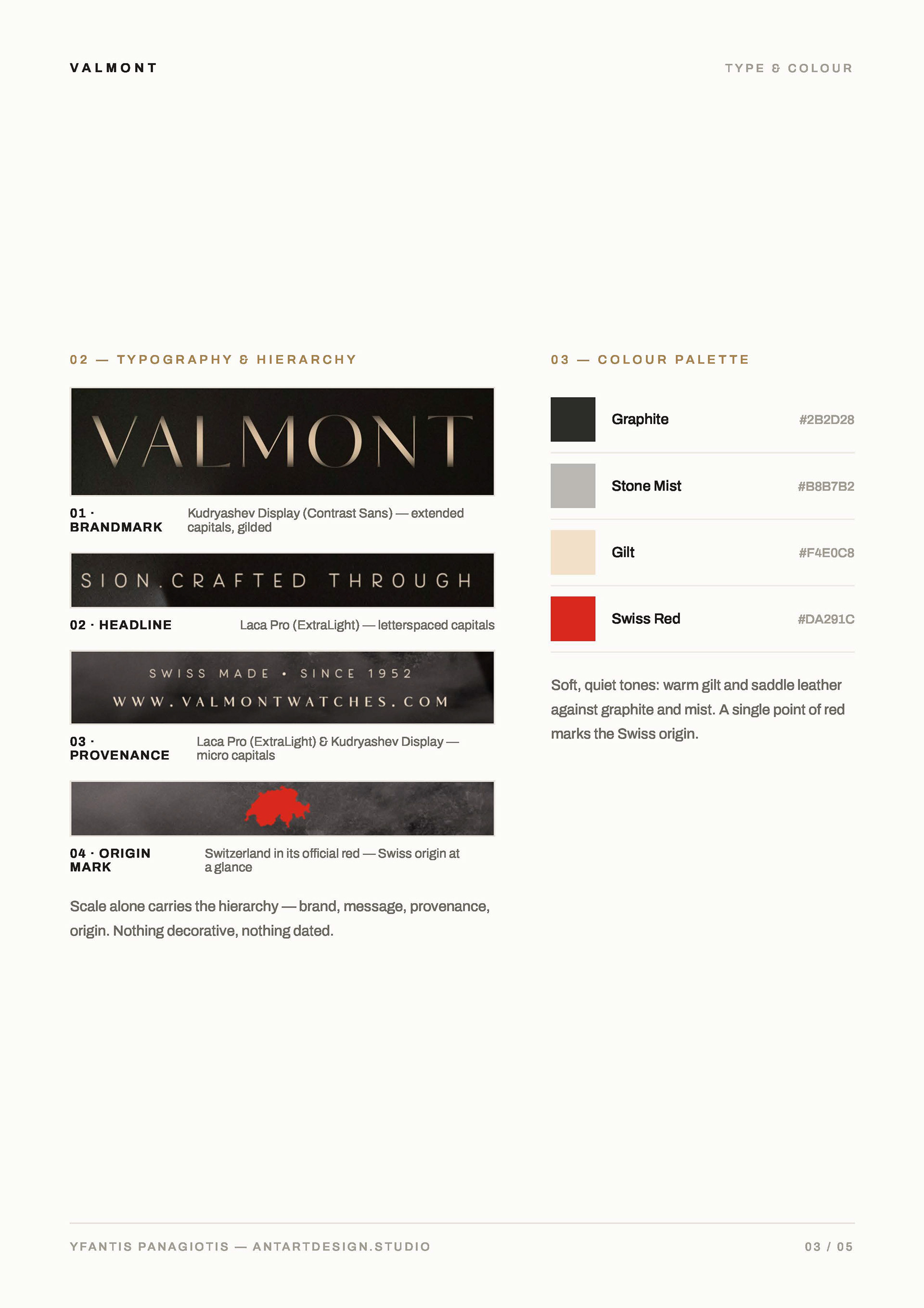
kudryashev display lends the brandmark its gilded, engraved calm; laca pro extralight carries the headline and provenance in quiet, letterspaced capitals.
the palette stays soft — warm gilt and graphite against stone mist — with a single point of swiss red marking the origin, the way a redseal marks a document.
luxury isn't loud. it's exact.